So, you are trying to use textured carpets to add depth to neutral rooms but are not sure where to start or what actually works.
You can add depth to a neutral room with textured carpets by layering different pile heights, patterns, and materials while keeping the color palette calm and controlled.
Most neutral rooms fall flat because everything is smooth, flat, and one-note. Texture is what makes a neutral space feel rich instead of boring. A textured carpet catches light differently, adds shadow, gives your eye something to read, and quietly anchors all your furniture. When you get the texture right, you can keep your whites, beiges, and greys and still have a room that feels full and intentional.
Things you need to know:
- Texture in carpets comes from pile height, yarn type, weave, and pattern, not just color.
- Neutral does not mean only beige; it includes greys, taupes, charcoal, off-whites, and muted earth tones.
- Low contrast color with high texture gives depth without visual noise.
- Loop, cut, and cut-loop constructions all behave differently in real rooms.
- The more light a room has, the more your carpet texture will show.
- Maintenance should drive your choice as much as style, especially in high-traffic areas.
- Layering rugs over carpet can add even more depth if you control pattern scale and color.
What “texture” in carpets really means
When you look at carpet in a store or online, most product pages lead with color, maybe pattern. Texture sits in the background, but that is what changes how neutral rooms feel.
Texture in carpet comes from four main things:
- Pile type (loop, cut, or a mix of both)
- Pile height (short, medium, or long)
- Density (how tightly the fibers are packed)
- Yarn material and twist (wool, nylon, polyester, blends)
> Think of texture as “how your hand and your eyes experience the surface,” while color is just what your eyes see at a quick glance.
If your walls are light, your sofa is a soft grey, and your curtains are off-white, then the floor is your biggest chance to bring in depth. A flat, low-texture carpet in that setting gives you a clean look, but it can feel sterile. A textured carpet creates micro-shadows and small variations that break up that flatness.
Types of carpet texture and how they change a neutral room
Here is a quick breakdown of the main texture types and what they do to a neutral space:
| Carpet type | Texture feel | Looks in neutral rooms | Good for |
|---|---|---|---|
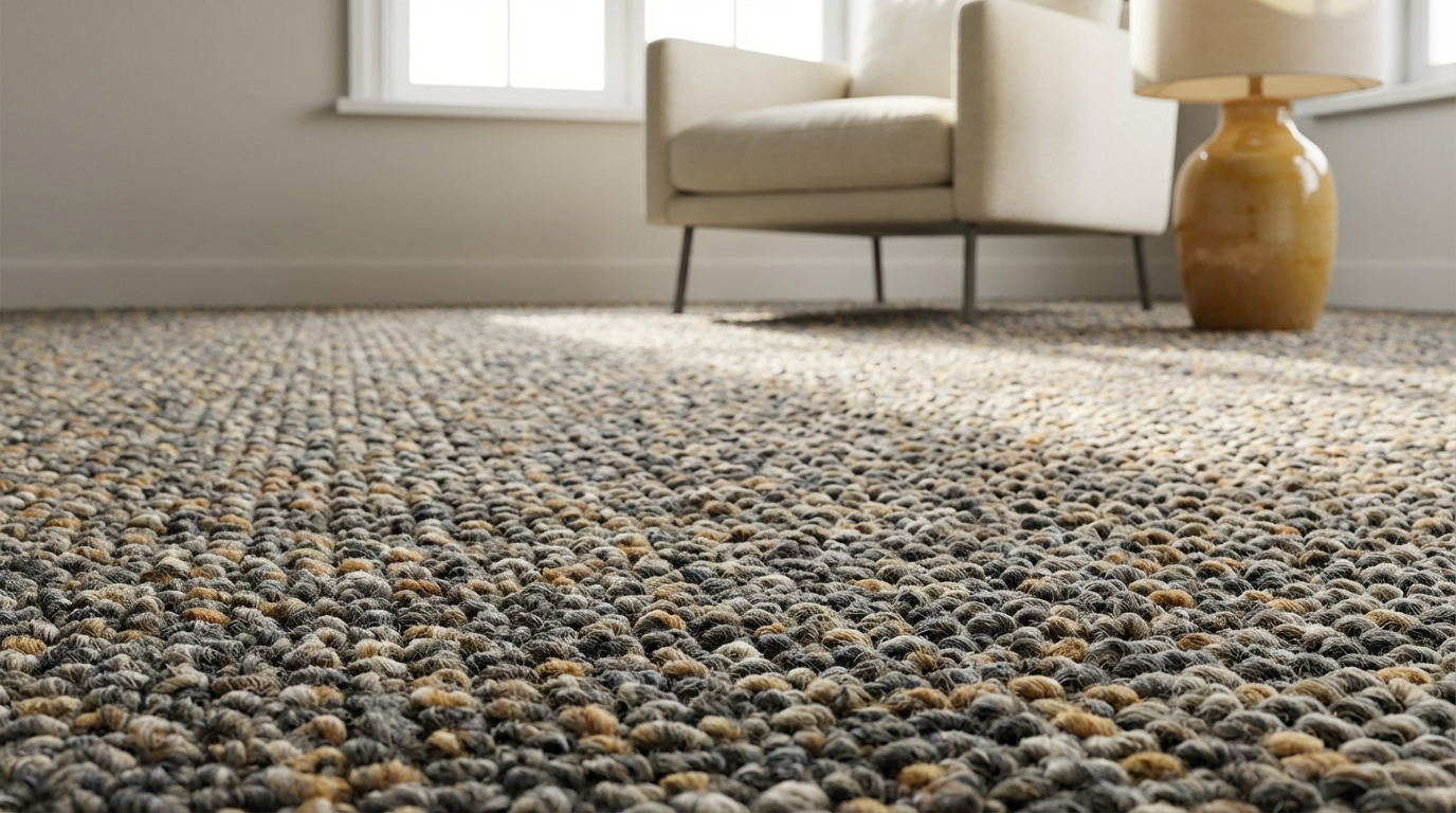
| Loop (Berber, level loop) | Firm, structured | Subtle pattern, tailored depth | Living rooms, hallways, family rooms |
| Cut pile (plush, saxony) | Soft, smooth | Lux look, shows footprints more | Bedrooms, low-traffic lounges |
| Textured cut (twist) | Casual, slightly varied | Breaks up solid color gently | Family rooms, kids rooms |
| Cut & loop | Patterned, dimensional | Visible pattern in same color family | Feature rooms, dining rooms |
| Shag / high pile | Deep, very soft | Big shadows, strong depth | Accent areas, small zones |
> If everything else in your room is flat (smooth leather sofa, flat-front cabinets, plain curtains), even a small pattern in the carpet can make the whole space feel more layered.
Neutrals and depth: why flat color is not enough
You can have a perfect neutral palette on paper, and the room still feels unfinished. That often comes from relying only on color harmony and ignoring surface change.
Neutrals do a few useful things:
- They calm visual noise.
- They help large items feel less heavy (like a big sectional).
- They give you flexibility to change pillows, art, and decor later.
But flat neutrals can also:
- Show every mark if the surface is too slick.
- Make furniture float if the floor lacks visual weight.
- Look “builder basic” instead of intentional.
> Texture is how you keep the calm benefits of neutrals without ending up with a room that feels forgettable.
Think of a matte wall vs a glossy one in the same color. The difference you feel is texture-related. Your carpet can play a similar role under all your furniture.
How texture interacts with neutral color
A few simple rules help you avoid guesswork:
- Lighter + more texture: Feels airy but still grounded. Good for small rooms.
- Darker + subtle texture: Feels solid and calm. Good for large rooms that need anchoring.
- Mid-tone + medium texture: Balanced, hides wear well.
If you have:
- White walls + beige sofa: A mid-tone greige loop with subtle flecks gives just enough movement.
- Warm taupe walls + cream sofa: A slightly darker textured cut pile stops the room from feeling washed out.
- Soft grey walls + charcoal accents: A low contrast cut-loop pattern in grey tones adds character without shouting.
Choosing the right textured carpet for your neutral room
So how do you move from “I know I need texture” to actually picking something that works in your space?
Use three filters:
- Room use and traffic
- Light conditions
- Existing materials and finishes
1. Match carpet texture to room use
Think about how you live in the room, not just how the room looks in photos.
- High traffic (hallways, family rooms, stairs)
Go for:- Loop or tight textured cut pile.
- Shorter to medium pile height.
- A bit of color variation (flecks or heathered yarn) to hide wear.
- Moderate traffic (living rooms, home offices)
Good options:- Cut and loop with a subtle pattern.
- Textured twist piles.
- Soft neutrals with pattern in the same tone.
- Low traffic (bedrooms, sitting rooms)
You can choose:- Plush cut pile for that soft underfoot feel.
- Longer pile or even light shag in smaller zones.
> A mistake I see often: people pick a gorgeous, super plush neutral carpet for a main living space, then they hate it 6 months later because every footprint and vacuum line shows up.
If you want your carpet to look clean without constant grooming, lean toward more texture and a bit less shine.
2. Read the light in your neutral room
Texture shows up differently in bright and dim spaces.
- Bright rooms with big windows
- Texture will be very visible because of shadow and highlight.
- You can go subtle; even a small pattern will show.
- Watch out for carpets that look streaky in strong daylight.
- Low-light rooms
- You might need more obvious texture or pattern.
- Too flat and the floor will look like a blank sheet.
- Mid-tone colors often work better than very light ones here.
> Always look at carpet samples on the floor at different times of day, not just in your hand under store lighting.
A quick test: lay two or three textured samples on the floor, take photos at morning, afternoon, and night. You will see which one gives depth across the whole day instead of only at certain times.
3. Balance with your existing finishes
Your carpet does not live alone. It works with:
- Sofa and chair fabrics
- Wood tones (floor edge, furniture, doors)
- Metal finishes (lamps, hardware)
- Wall paint and trim
If you have:
- A lot of visual interest already (grainy woods, nubby linen, woven shades)
Choose a quieter carpet texture. Maybe a level loop in a single tone, or a soft textured cut pile that supports, not competes. - Very smooth finishes (flat cabinet doors, smooth leather, glass, metal)
Choose a more pronounced texture like cut and loop or a heavier twist. The carpet can be the “soft contrast” that stops the room feeling cold.
> Depth in a neutral room comes from a mix of textures that do not all shout at once.
Try to mix:
- 1 smooth major surface (like a leather sofa)
- 1 medium texture (like the carpet)
- 1 rougher texture (like a woven basket or a chunky knit throw)
Common textured carpet styles that flatter neutral rooms
Let us talk about specific textured styles that tend to work well with neutral palettes.
Loop and Berber in neutral schemes
Loop pile (especially Berber-style) gives a clean, tailored look with a bit of movement.
What it brings:
- A subtle pattern from the loops.
- Good wear in active areas.
- Often small flecks of color that break up a solid neutral.
Good pairings:
- Warm beige loop with cream walls and oak furniture.
- Grey loop with cool white walls and black accents.
Potential downside:
- Loops can snag with pets, especially cats.
> If your neutral room has simple, straight-lined furniture, a loop carpet gives that “finished” look without feeling formal.
Cut and loop for quiet pattern
Cut and loop carpets use both sheared (cut) and uncut loops to create pattern.
Why they work well in neutral rooms:
- Pattern is often tone-on-tone, so color stays calm.
- The texture creates shadows that mimic depth.
- You can bring character without high contrast.
Common patterns:
- Geometric grids
- Subtle stripes
- Organic, almost woven looks
> A tone-on-tone geometric in a beige or sandy color can make a vanilla living room feel far more designed, without introducing bright color.
Use this in:
- Living rooms where you want a “hotel lounge” vibe.
- Home offices that need calm but not boredom.
Textured cut pile (twist) for casual depth
Textured cut piles often have yarns twisted in slightly different directions. That breaks up reflections across the surface.
What you get:
- A soft feel underfoot.
- Less visible footprints than in very smooth plush.
- Gentle, almost mottled appearance in one color.
This works well if:
- You want a cozy neutral space with kids or pets.
- You do not want to think about vacuum lines.
Shag and high pile as accents
Shag and very high pile carpet give big, dramatic texture, but they are not always practical wall-to-wall.
They can still play a strong role if you use them as:
- Area rugs over a low-texture wall-to-wall base.
- Defined zones like a reading nook or under a coffee table.
> A white or cream shag rug on top of a flat greige carpet gives layers of depth without changing the color story.
If you go this route, pick shags with:
- Shorter, denser fibers instead of extreme length.
- Colors within one or two steps of your base carpet.
Color strategy: staying neutral but not flat
Neutrals live on a spectrum. The trick is picking tones that work together and leave room for texture to show.
Warm vs cool neutrals
You do not need to obsess over color theory, but a simple check helps: put your carpet sample next to your wall color and furniture fabric.
- If everything has yellow, red, or brown undertones, you are in the warm camp.
- If everything leans blue, green, or violet, you are in the cool camp.
In many cases you want to stay in the same general family:
- Warm greige carpet with warm white walls and tan sofa.
- Cool grey carpet with crisp white walls and charcoal accents.
You can introduce a mild shift, but do it with intention:
- Warm taupe carpet with cooler grey textiles can feel layered if the undertones do not clash.
> When you want depth, small shifts within the same family feel much calmer than big jumps between warm and cool.
Depth through shade variation, not bright contrast
You do not need a dark carpet to get depth. Instead, use small steps in shade.
For example:
- Walls at 80 percent lightness, carpet at 60 percent, sofa at 40 percent.
They all stay neutral, but each surface has its own presence.
Practical combinations:
- Off-white walls, light greige carpet, medium grey sofa.
- Pale beige walls, medium warm taupe carpet, dark chocolate wood table.
If you love very light carpets:
- Choose texture with a hint of heathering or fleck to stop it looking like blank paper.
Using textured carpets to zone open-plan neutral spaces
Open-plan layouts with a neutral palette can feel like one long blur. Texture helps define zones without needing bold colors or hard boundaries.
Wall-to-wall base + area rugs
One of the simplest ways to add depth is to start with a textured neutral wall-to-wall carpet, then layer rugs.
You can:
- Use a flatter loop or cut pile as the base.
- Add a thicker, higher pile rug in the living zone.
- Add a low pile, patterned rug under the dining table.
> You stay within one neutral palette, but your feet and your eyes know where one space ends and the next begins.
Guidelines:
- Keep rug colors within two or three steps of the base carpet.
- Vary pattern scale: larger pattern in big areas, smaller in more compact spaces.
- Change pile height to create a physical sense of boundary.
Different textures across connected rooms
If you are not using wall-to-wall everywhere, you can still use texture to tell a story across rooms.
Example sequence:
- Entry: tough loop pile in a mid-tone neutral.
- Living room: softer cut and loop pattern in a slightly lighter shade.
- Bedroom: plush cut pile in a similar tone but deeper, for a softer feel.
They all sit in the same neutral family, so the home feels continuous, but each room has its own depth and mood.
How textured carpets affect acoustics and comfort
Depth is not just visual; you also feel it and hear it.
Textured carpets help:
- Absorb sound, cutting down echo in open or minimalist spaces.
- Soften footsteps, which gives a calmer feel in the room.
- Add physical warmth, especially in rooms with hard finishes like glass and stone.
> If you take a photo of a neutral room before and after adding a textured carpet, the difference is clear; but living in that space, the sound change is often what people notice first.
Higher pile and denser textures usually give more sound absorption, but even a low pile loop will improve things compared to bare wood or tile.
Maintenance, wear, and real-world trade-offs
Texture has a direct effect on how your carpet wears and how much work you have to do to keep it looking good.
Hiding dirt and traffic
For most households, you want a carpet that looks good in normal life, not just for photos.
Textures that hide wear better:
- Loop and level cut-loop patterns.
- Textured cut piles with slight variation.
- Heathered or flecked neutrals instead of flat solid tones.
Carpets that show more:
- Very smooth plush with uniform color.
- Very light shades with little texture.
> If you love a pale neutral, pairing it with a bit of texture and variation is one of the simplest ways to keep it looking presentable longer.
Cleaning considerations by texture
- Loop pile
Easier to vacuum, dirt sits more on the surface. Watch for snags. - Textured cut pile
Traps some dirt but vacuums well with a beater bar set at the right height. - Shag / high pile
Comfort trade-off: you get lush feel but more effort to clean. Better as rugs than full rooms for most people.
For neutral rooms, stains can feel more obvious, so:
- Use stain-resistant fibers or treatments where possible.
- Keep a consistent cleaning routine to avoid traffic paths carving out lighter or darker streaks.
Examples: textured carpets changing neutral rooms
Let us walk through a few scenarios so you can map this to your own space.
Example 1: Beige living room that feels flat
Starting point:
- Light beige walls.
- Cream fabric sofa.
- Pale wood coffee table.
- Smooth, low-texture beige carpet.
Problem:
- Everything is similar in tone and smooth in texture. The space feels a bit empty and uninteresting.
Textured carpet solution:
- Switch to a cut and loop carpet in a warm greige, one shade darker than the walls.
- Choose a subtle geometric pattern in the same color, so the pattern appears mainly through texture.
Result:
- The floor now creates shadows and a sense of movement.
- The sofa looks more grounded.
- The entire room gains depth without adding bold color.
Example 2: Cool grey open-plan space that feels cold
Starting point:
- Cool white walls.
- Grey sectional with smooth upholstery.
- Black metal coffee table and lamps.
- Hard wood floors throughout, no rugs.
Problem:
- The room feels echoey and a bit harsh. Visually, it is clean but not very welcoming.
Textured carpet solution:
- Add a large, textured loop rug in a light grey with subtle flecking in medium grey.
- Place it under the seating area, large enough so front legs of all main furniture sit on the rug.
Result:
- Footsteps and echo drop noticeably.
- The grey-on-grey palette still reads neutral and modern, but the loop texture introduces warmth and depth.
- The seating area becomes a clear “zone” within the open plan.
Example 3: Bedroom with white everything
Starting point:
- White walls.
- White bedding.
- Light wood nightstands.
- Flat, light carpet in off-white.
Problem:
- The space feels clean but almost clinical. Light bounces everywhere with no break.
Textured carpet solution:
- Install a plush textured cut pile carpet in a soft warm greige.
- Choose a yarn with mild tonal variation so the surface has gentle movement.
Result:
- The bed feels anchored.
- The greige adds just enough contrast to make the white bedding pop.
- The plush texture adds physical comfort and visual softness, turning “blank” into “quiet and restful.”
Sampling strategy: how to test textured carpets in your neutral room
You can save yourself a lot of regret by testing the right way before you commit.
Step 1: Get larger samples
Ask for the biggest samples you can get, or borrow sample boards. Small swatches hide pattern and texture.
Aim for:
- Larger than a sheet of paper, if possible.
- At least two or three texture types in similar tones.
Step 2: Test in three spots
Place the samples:
- Near the main seating area.
- By a window where light shifts during the day.
- Near a doorway where you will see the carpet first.
> Look at the samples both standing up (how you see the room), and from above (how your camera or social posts will see it).
Take photos at different times. Texture that looks rich at night but streaky during the day might drive you crazy long term.
Step 3: Pair with your textiles
Lay the carpet samples with:
- Sofa or chair fabric swatches.
- Curtain or blind samples.
- A paint chip for the walls.
Check:
- Does the carpet feel too flat next to your fabrics?
- Does the pattern fight with any existing patterns?
- Do the undertones look friendly together or slightly off?
If two options both work, choose the one that:
- Hides footprints and vacuum marks better when you run your hand across it.
Using pattern scale to add depth without visual clutter
Pattern scale is easy to overlook, but it matters for depth and calm.
Large, medium, and small pattern logic
You can think of pattern in three sizes:
- Large scale: Big geometrics or broad stripes.
- Medium scale: Repeated shapes a few inches wide.
- Small scale: Tight patterns and textures, like small loops or fine herringbone.
Neutral rooms often do best when:
- You pick one hero pattern scale.
- Keep others subtle or in different zones.
For example:
- Large-scale pattern on carpet in the living room, small-scale patterns on cushions.
- Small-scale loop texture on carpet, larger pattern on curtains.
> If everything is small-scale texture, the room can still feel flat, just busy. You want enough change between surfaces that each layer reads clearly.
Material choices: wool, synthetics, and blends in neutral rooms
Texture also comes from fiber, not just construction.
Wool
Pros:
- Naturally springy texture that recovers well.
- Rich, matte look that works nicely with neutrals.
- Often feels deeper because fibers catch light softly.
Cons:
- Higher cost up front.
- More care with certain cleaners.
Nylon and polyester
Pros:
- Wide range of textures and patterns.
- Often very stain-resistant.
- Budget-friendly options.
Cons:
- Some sheens can highlight footprints in certain styles.
Blends
Wool blends or mixed fiber carpets can balance durability and feel. What matters for depth in neutrals is often how matte or shiny the surface is.
> A slightly matte, textured surface usually gives a richer sense of depth than a very shiny, very flat one in the same color.
If you want a calm, soft neutral space, lean toward more matte finishes in your carpet.
Practical layout tips for textured carpets in neutral rooms
A few small layout choices make a big difference in how the texture reads.
Size and placement with furniture
If you are using an area rug over a hard floor or flat carpet:
- In living rooms, aim for at least front legs of sofas and chairs on the rug.
- Under dining tables, extend the rug at least 24 inches past the table edge on all sides.
- In bedrooms, let the rug extend 18 to 24 inches past the sides and foot of the bed.
This gives enough surface area for the texture to read as part of the room, not as a small patch.
Direction of pattern
If your textured carpet has a directional pattern (like a subtle stripe or linear element):
- Run the pattern along the longest dimension of the room to stretch the space visually.
- Line it up with main sight lines, like the entry view into a living room.
> Our eyes are very good at picking up subtle lines, even in tone-on-tone carpets, so you can quietly control how large or small a room feels.
How to “stack” textures around your carpet
To really use your carpet texture, think of the room as layers building up from the floor.
Layer sequence:
- Base: Carpet texture (loop, cut, pattern, etc.)
- Middle: Upholstery and case goods (sofa, chairs, tables)
- Top: Textiles and accents (throws, pillows, baskets, shades)
One simple approach:
- Let the carpet carry medium-level texture.
- Keep the sofa smoother.
- Add a chunkier knit throw or woven cushion on top.
> The goal is not to make every piece textured, but to create a rhythm: smooth, textured, smoother, textured again.
In a neutral palette, that rhythm is what gives the eye something to enjoy.
Signs your textured carpet choice is working
You know you are on the right track when:
- The room feels calm but not blank.
- You notice gentle shadow and light variation across the floor during the day.
- Furniture looks anchored instead of floating.
- You do not feel the urge to “fix” the room by buying lots of decor items in strong colors.
Walk into the room from another part of your home and pause. If your eye moves from the floor, to the main furniture, to the walls without getting stuck or bored, your textures are likely balanced.
> One practical tip: when you think you are done, sit on the floor for a minute. Look around from that level. If the carpet texture still feels right and the room feels grounded from that angle, you have probably nailed it.