So, you are trying to figure out how to mix wood tones and match your furniture to your floors without the room looking messy or random.
The direct answer is: keep your floor as the “main” wood, then repeat its undertone and depth (light, medium, dark) in at least two other pieces so the room looks intentional, not accidental.
You are not trying to match every wood piece exactly. That usually makes a room feel flat and a bit like a showroom. You are trying to create a small “family” of wood tones that share an undertone and contrast level. Once you get that, mixing oak, walnut, maple, and others starts to feel simple, not scary.
Things you need to know:
- Your floor is the anchor wood tone. Everything else works around it.
- Undertone (warm, cool, neutral) matters more than the exact color.
- Light, medium, and dark contrast can fix a lot of mismatched wood.
- Repeat each wood tone at least twice so it feels intentional.
- Large surfaces (floors, big tables, cabinets) set the mood of the room.
- Rugs, textiles, and paint can soften clashes between wood tones.
- Finish (matte, satin, glossy) affects how the color looks in real life.
- Natural and artificial light will change how wood reads during the day.
> If you only remember one line from this article, remember this:
> Match undertones, mix shades.
Why matching furniture to floors feels so hard
So you buy a new coffee table or bed frame, bring it home, put it on your existing floor, and suddenly… it looks off. Not awful, just off.
You start asking questions like:
- “Does every wood piece need to be the same color?”
- “Can I put dark furniture on dark floors?”
- “Why does this expensive table look orange in my room but not in the store?”
You are not imagining it. Wood is tricky because:
- Wood has undertones that shift with light.
- Big surfaces (floors) dominate what your eye sees first.
- Photos online are edited, and store lighting is very different from your home.
So instead of guessing, you need a small system you can reuse in every room.
> Think of your floor as the background of a website: once that is set, everything else either fights it or supports it.
Step 1: Identify your floor’s undertone
Before you match anything, you need to know what your floor is “saying.”
Most wood floors fall into one of three buckets:
- Warm: yellow, orange, red undertones
- Cool: gray or slightly ashy undertones
- Neutral: a mix that does not read clearly warm or cool
How to check your floor undertone the simple way
You do not need fancy tools. Just use things around the house.
- Grab a plain white sheet of paper and place it on the floor in daylight.
- Look at the floor next to the white paper, not at the paper itself.
- Ask: “Do I see more yellow/orange/red, or more gray, or is it right in the middle?”
If you are still not sure, compare your floor against objects:
- Hold a cool gray T-shirt or sweater near the floor.
- Hold something clearly warm, like a tan belt or manila folder.
If the floor looks nicer next to the gray, it probably leans cool. If it looks better next to the tan, it leans warm.
> Your eye is much better at “warmer than” or “cooler than” than it is at labeling a color out of context.
Common floor types and their usual undertones
| Floor type | Typical look | Usual undertone | Furniture that pairs well |
|---|---|---|---|
| Traditional red oak (honey finish) | Light to medium, slightly orange/yellow | Warm | Other warm woods, soft white, cream, medium walnut |
| Dark espresso / Java | Very dark brown, almost black | Often neutral-warm | Light oak, whitewashed pieces, medium walnut, white |
| Gray-stained floors | Light to medium gray | Cool | Cool-toned woods, black, white, charcoal |
| White oak (natural / clear finish) | Pale, soft beige-gold | Neutral-warm | Almost anything, as long as undertones do not clash strongly |
| Laminate with strong red or orange pattern | Medium with clear red/orange cast | Warm (often strong) | Keep other woods more muted, add lots of neutrals |
If you have laminate or vinyl that imitates wood, treat it the same way as real wood. You still see undertones first.
Step 2: Decide how much contrast you want
Once you know the undertone, decide how light or dark you want your main furniture pieces compared to the floor.
Think in three bands:
- Light: bleached, whitewashed, pale oak, light maple
- Medium: honey oak, mid walnut, medium cherry
- Dark: walnut, espresso, dark-stained oak
Three simple contrast strategies
You have three basic choices. None is “right,” they just give different moods.
| Strategy | What it means | Visual effect | Good when |
|---|---|---|---|
| Similar depth | Furniture close in lightness to floor | Soft, calm, blended | You want a quiet, relaxed room |
| High contrast | Light furniture on dark floors or dark furniture on light floors | Bold, defined shapes | You want furniture to stand out clearly |
| Mixed depth | One main tone, one accent tone (example: medium + some dark) | Layered, more visual interest | You have several wood pieces you want to combine |
> When in doubt, choose higher contrast for big anchor pieces and softer contrast for small side tables.
Examples
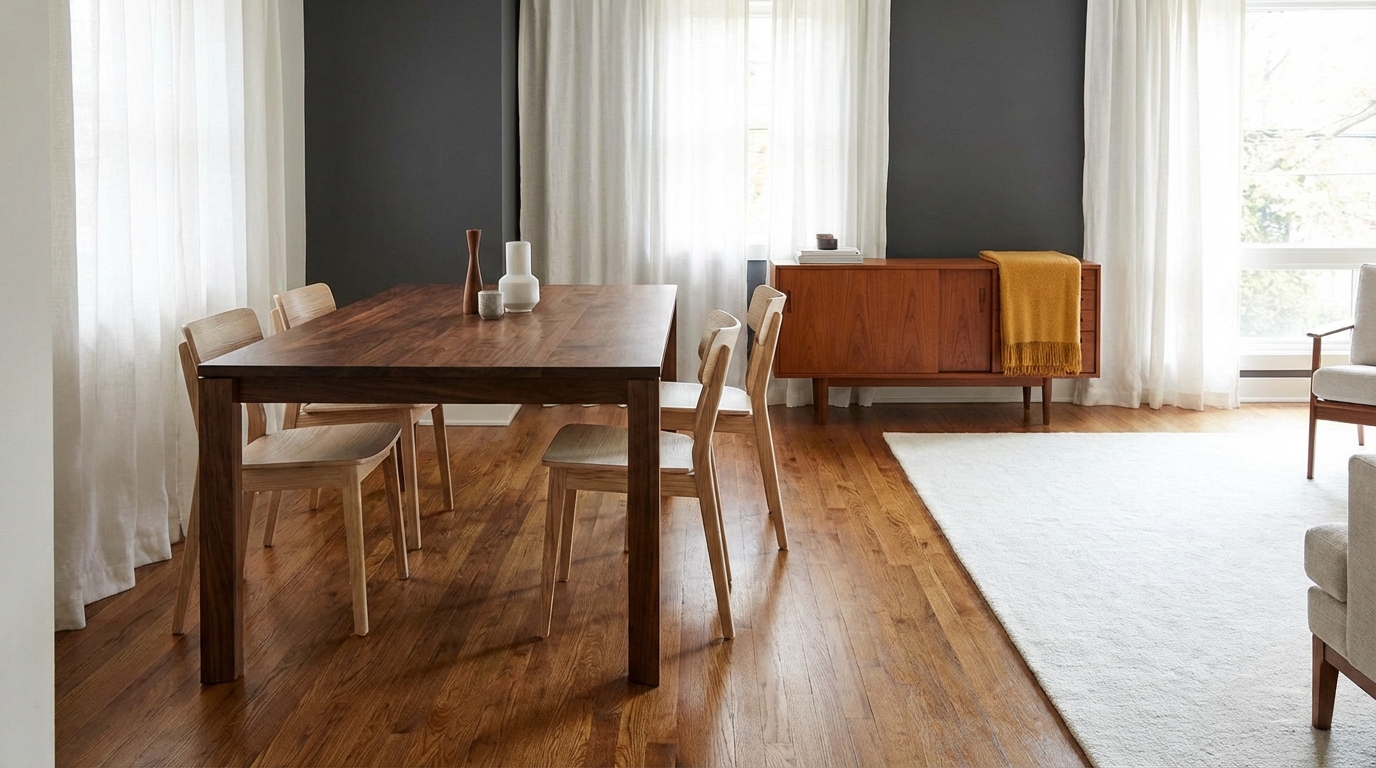
- Dark floors, light furniture: Dark walnut floor with light oak dining table and light wood chairs. Looks clean and modern. The table floats off the floor.
- Light floors, medium furniture: White oak floors with a medium walnut sofa frame and media console. Feels balanced and warm without being heavy.
- Medium floors, darker accent: Honey oak floor, medium-tone wood bed, and a dark walnut dresser as an accent piece. The dresser becomes a focal point, not an error.
If you already own most of your furniture, your decision is almost made for you. Let your largest existing piece and your floor decide the contrast, then fit the rest around that.
Step 3: Match undertones, not exact colors
This is where most people get stuck. You do not need to find the “exact same” stain as your floor. In fact, that can look forced.
You only need two things:
- Same undertone family (warm with warm, cool with cool, or balanced with neutral).
- Enough difference in lightness so they do not look like a failed attempt to match.
> If two wood tones are almost the same but not quite, they often look like a mistake. If they are clearly different, it looks like a choice.
How to tell if undertones match
Put wood samples or images side by side and ask:
- Do both move toward yellow/orange/red? Then they are warm cousins.
- Do both lean smoky/gray? Then they are cool cousins.
- Does one look orange and the other pink/red? They might fight each other.
If you shop online, here is a neat trick:
- Take a screenshot of the furniture and a photo of your floor.
- Place them side by side on your screen and reduce saturation a bit.
- If one becomes much more gray or much more yellow in low saturation, they are not close in undertone.
It is not perfect, but it gives you a fast gut check.
Pairing chart: common floor tones and furniture matches
| Floor tone | Good furniture tones | Avoid (or use very sparingly) |
|---|---|---|
| Warm honey oak | Other warm woods, walnut with a warm cast, off-white painted pieces | Very gray woods, cool blue-gray stains |
| Reddish cherry | Warm dark walnut, black, cream, fabrics that soften the red | Orange-yellow stain that fights with the red |
| Cool gray floor | Cool walnut, black, white, gray-wash, light oak that is not too yellow | Orangey pine, strong yellow stains |
| Neutral white oak | Almost any wood if you repeat it elsewhere and balance it | Clashing strong red + strong orange in the same space |
If you must mix warm and cool woods in one room, keep one of them dominant in large pieces, and limit the other to one or two accents. Then buffer with textiles and paint.
Step 4: Repeat wood tones so the room feels intentional
One of the easiest ways to make mixed woods feel planned is simple:
- Repeat each main wood tone at least twice in the room.
If you have:
- Warm oak floors
- A dark walnut coffee table
- A light beech side table
Right now the dark walnut and the beech each appear only once. They can feel random.
Fix that by repeating them:
- Add a dark walnut frame or a lamp with a dark wood base.
- Add a light wood picture frame, bench, or chair that matches the beech tone.
> Your eye likes patterns. When a color or tone shows up in at least two places, it feels like it belongs.
What to repeat
You can repeat any of these:
- The exact wood type (walnut with walnut).
- The stain color (espresso, honey, etc.).
- The undertone and depth (two warm medium-toned woods, even if different species).
Think of it like your site color palette. One dominant color, one secondary, and maybe one accent. Same idea, just with wood.
Step 5: Use rugs to bridge gaps between furniture and floor
If your wood tones are a bit off and you are not ready to replace pieces, a rug is your best friend.
Rugs do three things:
- They visually separate furniture legs from the floor.
- They let you bring in colors that flatter both the floor and the furniture.
- They soften contrast if two wood tones are fighting.
How to choose a rug to help wood tones work
- For dark floors + dark furniture: Pick a lighter rug that sits between them. This keeps the room from feeling heavy and lets the furniture “lift” off the floor.
- For light floors + light furniture: Use a rug with some medium or dark pattern. This adds depth and keeps things from feeling washed out.
- For warm floors + cool furniture (or the other way around): Look for a rug that includes both a warm neutral (tan, beige, camel) and a cooler neutral (gray, charcoal).
> A rug is like a buffer. When wood tones are fighting, give them something in the middle to agree on.
If you cannot afford a large rug, even a runner under a bench or a smaller rug under a coffee table helps more than you might think.
Step 6: Pay attention to finish and sheen
Two pieces of wood can have the same color but look different because of the finish.
Finish affects:
- How much light bounces off the surface.
- How deep or flat the color appears.
- How visible the grain looks.
Common finishes:
- Matte: low reflection, more natural, hides small scratches.
- Satin: a bit of soft sheen, very common.
- Glossy: high reflection, can feel more formal or dressy.
If your floor has a strong sheen and your furniture is ultra matte, it can feel like they do not belong together even if the color is close. You do not need them to match, but try not to have one piece that is wildly different from everything else unless it is meant to be a showpiece.
> When something looks off and you cannot tell if it is the color, check the sheen. Sometimes it is just the shine level, not the stain.
You can sometimes adjust furniture by lightly sanding and applying a new top coat with a different sheen, even if you keep the same stain color.
Step 7: Use paint and textiles to control how wood feels
You do not need to change your floor or your furniture to improve the match. Walls and textiles have a huge impact.
Wall colors that help mixed woods
- Warm woods work well with creams, warm whites, soft beige, and muted greens.
- Cool woods pair nicely with cool whites, soft grays, blues, and some muted greens.
- Very dark floors often look better with lighter walls to keep the room from feeling cramped.
If your floor is very warm and your furniture is a bit cooler, pick a wall color that sits between them, like a neutral off-white. That balances both.
Textiles that tie wood tones together
Think about:
- Curtains
- Cushions
- Throws
- Bed linens
- Upholstery
If your space has several warm wood tones, adding soft white or cool gray textiles can keep it from feeling too intense. If you have cool gray floors and a warm wood dining table, add chairs with seat cushions that have a bit of gray and a bit of warm beige.
> Textiles are like the “CSS” of your room. They do not change the structure, but they change how everything feels visually.
Step 8: Handling tricky cases (what if things already clash?)
Maybe your floors are staying. Your budget is fixed. You already own a few pieces you like. Here is how to handle common real-world setups.
Case 1: Orange oak floors with gray furniture
You see this a lot in homes where the flooring is older but the furniture is more recent.
Problems:
- The floors lean warm and strong (orange or yellow).
- The furniture leans cool and flat (gray).
Fixes:
- Add a rug that has both warm and cool neutrals.
- Bring in one or two pieces that bridge the gap, like a wood coffee table in a neutral-warm stain (less orange, more “natural”).
- Pick a wall color that is a soft neutral, not pure gray or strong beige, to soften the difference.
Case 2: Dark floors, dark furniture, room feels heavy
Problems:
- Floor, dining table, and chairs are all dark.
- Distance between tones is small, so everything blends together.
Fixes:
- Add a light rug under the table.
- Introduce lighter textiles, like light chairs or cushions.
- Bring in one or two lighter wood pieces, such as side tables, picture frames, or shelving.
> When everything is dark, your eye loses edges. Give it some lighter shapes so the room feels defined again.
Case 3: Light floors, white furniture, room feels cold
Problems:
- Very light floors and white or off-white furniture.
- Not enough depth or warmth.
Fixes:
- Add a medium or dark wood coffee table or console.
- Use a rug with some warm tones (tan, camel, rust in small amounts).
- Introduce plants or textured fabrics to break the flatness.
Step 9: Testing before you commit
Just like you would test different calls to action on a landing page, test your wood combinations before spending a lot.
Simple test methods
- Use samples: Many stores will send small wood samples or finish swatches. Place them on your floor in different parts of the room.
- Check in different light: Look at the samples in morning, midday, and evening light, and with lamps on at night.
- Mockup with images: Screenshot your floor and the furniture product photo, then create a simple collage on your phone or computer.
> Never decide based on store lighting alone. Your home has different bulbs, windows, and shadows.
If the piece is from a local store, ask if you can bring a chair or small table home and return it if it does not work. That small experiment can save you from a larger wrong purchase.
Step 10: Room by room tips (living, dining, bedroom, office)
You use each room differently, so how the wood reads changes too.
Living room
Key wood surfaces:
- Floors
- Coffee table
- TV console
- Side tables
- Shelving
Guidelines:
- Let the floor and coffee table set the main relationship.
- Match the console either to the floor’s undertone or to the coffee table’s depth.
- Use side tables as accents in a second tone, then repeat that tone in smaller details (frames, lamps).
Example setup:
- Medium warm oak floors
- Medium warm walnut coffee table
- TV console close to the coffee table tone
- One light wood side table to keep it from feeling too similar everywhere
Dining room
Key wood surfaces:
- Floors
- Dining table
- Chairs
- Buffet or sideboard
Guidelines:
- Treat the table like an anchor piece. Match its undertone to the floor or choose clear contrast.
- If chairs are wood, you can either match them closely to the table or let them be a lighter or darker version.
- Repeat the table tone in the sideboard so it does not feel alone.
Example:
- Dark walnut floors
- Light oak dining table
- Chairs in a similar light oak or with fabric seats to soften contrast
- Sideboard in light oak, maybe with darker hardware that talks to the dark floor
Bedroom
Key wood surfaces:
- Floors
- Bed frame or headboard
- Nightstands
- Dresser
Guidelines:
- Match the bed and nightstands as one “set” visually, even if they are not from the same line.
- Let the dresser either match the bed tone or be clearly darker or lighter as an accent.
- Use rugs heavily here, since you often see the floor around the bed.
Example:
- Light neutral oak floors
- Warm medium wood bed and nightstands
- Dark walnut dresser as a grounded piece
- Rug with a mix of warm neutrals that connects all three tones
Home office
Key wood surfaces:
- Floors
- Desk
- Shelving or bookcases
Guidelines:
- Pick a desk finish that is comfortable to look at for long periods. Medium tones or matte finishes are usually easier on the eyes than very dark glossy.
- Match shelving to the desk or the floor’s undertone so your background on video calls looks unified.
> If you take video calls from your desk, your furniture and floors are almost like your brand. A simple, repeated wood tone in the background looks more put-together than a mix of random pieces.
Digital trick: Using your phone to “eyedropper” wood colors
You can borrow a small trick from digital design when working with wood.
Here is a quick method:
- Take a clear photo of your floor in daylight.
- Take a clear screenshot or photo of the furniture piece you are considering.
- Open a basic photo editing app that has a color picker.
- Pick a few spots on the floor and a few on the furniture to see their colors side by side.
You are not doing a scientific color match. You are just checking:
- Does the floor color sit closer to yellow or gray on the screen?
- Does the furniture color sit closer to red, orange, or gray?
If both move in a similar direction as you adjust brightness or saturation, you are usually safe. If one shifts strongly greenish or very orange while the other goes neutral, they might be harder to pair.
Common myths about mixing wood tones
There are a few myths that hold people back.
Myth 1: All wood in a room has to match
If everything matches perfectly, the room can feel flat, like a catalog set. Mixed wood tones can look more real and more layered, as long as they share undertones and you repeat them.
Myth 2: You cannot mix warm and cool woods
You can, but you need structure:
- Pick a dominant family (warm or cool).
- Keep the other family in small doses.
- Use rugs, textiles, and paint to bridge them.
Myth 3: Dark furniture always makes a room feel small
Dark furniture on light floors can look sharp and clear. Problems start when both the floor and all the furniture are dark and there is no contrast or natural light.
> Scale, light, and contrast matter more than the color itself when you think about how large or small a room feels.
When to break the “rules”
Design “rules” are just patterns that usually work. There are times when breaking them gives you a more interesting space.
Some cases where breaking rules works:
- You have a heirloom piece with a strong tone that matters to you emotionally. Build around it, even if it is not a perfect match.
- You want a very eclectic look with several distinct wood finishes. You can still repeat each one at least twice and tie them with consistent hardware or textiles.
- You like strong contrast and do not mind a bit of tension between warm and cool tones. That is a valid style choice.
You do not need a perfectly neutral, “safe” room for it to be good. You just want something that looks like you did it on purpose.
> If it looks intentional and you enjoy it, you are doing it right.
Practical checklist you can use before buying anything
Here is a quick process you can reuse for every new wood piece you think about bringing home:
- Identify your floor undertone: warm, cool, or neutral.
- Decide the contrast: should the new piece be lighter, similar, or darker than your floor.
- Check undertone: does the new piece lean in the same direction as the floor, or is it fighting it.
- Plan repetition: where else in the room or home will that tone appear at least once more.
- Think about buffers: do you need a rug, textiles, or paint change to help them work together.
- Test with photos or samples in your actual space and lighting.
If you want one very fast trick for your next purchase, take a photo of your floor in good daylight and keep it in your phone’s favorites. Every time you look at wood furniture online or in a store, hold it next to that photo and ask yourself one question:
> “Does this look like a cousin to my floor, or does it look like it is from a completely different family?”
That one small habit will save you a lot of regret.