So, you are trying to figure out flooring and wall color combinations that always work. The short answer is: stick to a few proven pairings like light wood + warm white, medium oak + greige, dark floors + soft neutrals, and cool tiles + warm walls, then adjust depth (light vs dark) rather than chasing rare color tricks.
You are not alone. Picking floors and walls sounds simple until you stand in a store with 40 beiges, 20 greys, and a salesperson staring at you. The good news is color is more about relationships than about the exact paint name. If you control contrast (light vs dark), undertone (warm vs cool), and texture, you can get a room that feels pulled together almost every time.
Things you need to know:
- Most “safe” combos are built on neutrals with clear warm or cool undertones.
- Light floors are forgiving and work with more wall colors than dark floors.
- Undertones matter more than names like “oak” or “greige.”
- Keep strong color to one surface: either the floor or the wall, not both.
- Large samples on the floor and walls beat any photo or Pinterest board.
Color decisions are easier when you decide if a room is mostly warm or mostly cool, and stick to that for the big surfaces.
Why some flooring and wall color pairs always look right
Before talking about specific combos, you need a quick mental model.
You do not need a degree in color theory. You just need three simple checks:
- Light vs dark (contrast)
- Warm vs cool (undertone)
- Clean vs muddy (how gray or saturated a color feels)
If you get those three working together, you can make even cheap laminate look more expensive.
1. Contrast: light vs dark
Think about your room as three layers:
- Floor (bottom)
- Walls (middle)
- Ceiling (top, usually lightest)
A simple rule that works almost everywhere:
- Floor: darkest
- Walls: medium
- Ceiling: lightest
You do not have to follow this every time, but when you do, rooms tend to feel grounded and comfortable.
Example:
- Dark walnut floor
- Soft warm greige walls
- Off white ceiling
The floor anchors, the walls wrap, the ceiling lifts. Very hard to mess up.
2. Undertone: warm vs cool
Warm undertones: yellow, red, orange, pink, brown.
Cool undertones: blue, green, violet.
Most wood floors are warm. Most concrete, many tiles, and many modern greys are cool.
Mixing warm and cool can look good, but when you mix them by accident, things feel off.
Quick test:
- Put your floor sample beside printer paper (pure white).
- If it looks slightly yellow, red, or brown, that is warm.
- If it looks slightly blue, green, or purple, that is cool.
Then make walls that echo that undertone instead of fighting it.
3. Clean vs muddy
A “clean” color is bright and clear, like fresh blue.
A “muddy” color has grey or brown mixed in, like greige or taupe.
Most flooring is muddy. Knots, grain, texture, variation, all of it pulls in gray or brown.
That means:
- Clean, bright walls with muddy floors can feel disconnected.
- Muddy, soft walls with muddy floors almost always feel calm.
If your floor has a lot of variation, go softer and more muted on the walls so the room does not feel busy from top to bottom.
Classic flooring and wall color combinations that rarely fail
Let us walk through pairings that work in real houses, with kids, pets, and actual furniture, not just in photos.
I will group them by floor type and tone, and then match wall ideas.
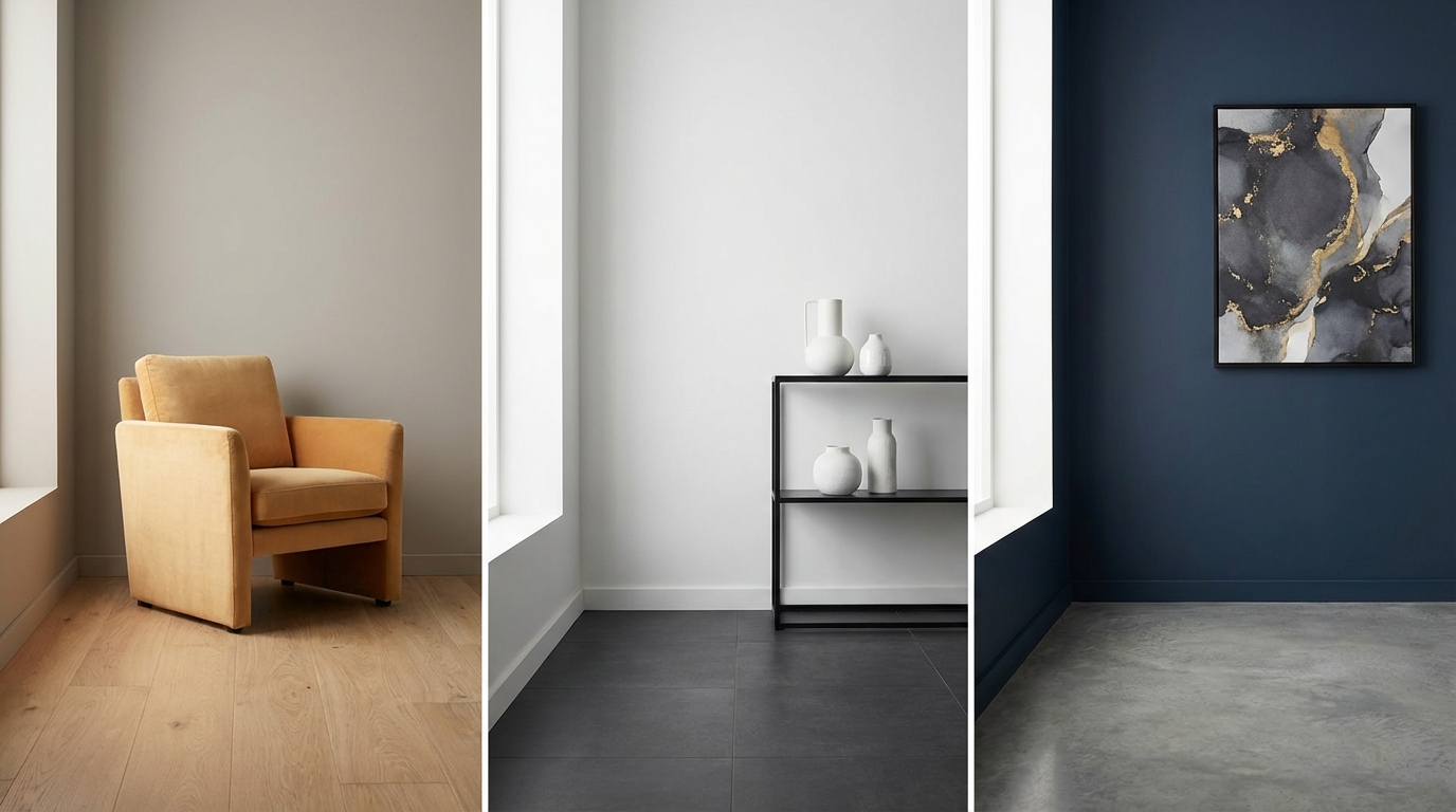
Light wood flooring combinations
Light oak, maple, whitewashed or Scandinavian style floors give you a lot of flexibility. They bounce light, hide dust, and support both modern and traditional styles.
1. Light wood + warm white walls
This is probably the safest combination you can pick.
- Floor: pale oak, natural maple, white oak, blonde laminate or vinyl.
- Walls: warm white with a hint of cream or beige.
Why it works:
- Light + light keeps the space bright and open.
- Both surfaces are warm and soft, so nothing clashes.
- You get a neutral base for any future decor changes.
Think:
- Floor: light oak planks with subtle grain.
- Walls: “Swiss Coffee” style warm white (many brands have similar shades).
If you are overwhelmed by choices, start by pairing a warm white wall with a pale wood floor. Then adjust one step warmer or cooler from there.
Where this works best:
- Smaller rooms or apartments that need more light.
- Spaces with low ceilings.
- Open concept rooms that share one main floor color.
2. Light wood + soft greige walls
Greige is that sweet spot between grey and beige. It reads warm without looking yellow, and modern without feeling cold.
- Floor: pale oak, light hickory, or ash.
- Walls: greige that leans a little warm (tiny bit of brown vs purple).
Why it works:
- Greige echoes the natural variation in light wood.
- The combination feels calm but not stark.
- It supports wood furniture without blending in too much.
This is strong if:
- You use both wood and black or metal accents.
- You like modern but do not want flat white walls.
3. Light wood + muted green or blue walls
If you want color, pale wood is your friend. It handles soft greens and blues well if you stay muted, not bright.
- Floor: white oak, maple, bleached wood look.
- Walls: soft sage, blue-grey, or blue-green.
Key tips:
- Keep saturation low. Think greyed-out color, not saturated teal.
- Match undertone: warm green works with warm floors, cooler blue with cooler light woods.
Example:
- Floor: light oak with faint gray streaks.
- Walls: blue-grey with a drop of green, very soft.
This gives a calm, somewhat coastal feel without going all white.
Medium wood flooring combinations
Medium tones like classic oak, chestnut, or honey work in many houses, but undertone control matters more here. Go too yellow on the walls and the whole room can feel dated.
4. Medium oak + warm greige walls
This is the “I do not want grey, but I do not want beige” setup.
- Floor: classic oak with medium brown, no strong red.
- Walls: greige that is a tiny bit warmer than a pure grey.
Why it works:
- Greige balances the warmth in the wood without fighting it.
- The contrast is soft, not high, so the room feels calm.
- Works with black fixtures, white trim, or brushed metals.
This pairing is strong if you have:
- Mixed era furniture.
- White kitchen cabinets nearby.
- Different wood tones in the same room.
5. Medium wood + warm white walls
If your floor is a bit busy (grain, knots), plain warm white walls help everything breathe.
- Floor: medium plank with visible grain.
- Walls: warm white, not bright “gallery” white.
Avoid pairing:
- Very yellow beige with very yellow wood. They can amplify each other.
Instead, you want:
- Neutral white with only a hint of cream.
When your floor has a strong color, lower the color on the walls. Let one surface lead, not both.
6. Medium wood + rich earthy walls
If you like mood, medium floors can handle deeper colors without the room feeling heavy.
Good wall colors here:
- Deep olive or forest green.
- Muted clay or terracotta.
- Smoky navy (blue with gray).
Practical rules:
- Keep trim light (off white) to frame the color.
- Use this in rooms with enough natural light.
This combination shines in:
- Dining rooms.
- Home offices.
- TV rooms where a slightly darker feel is fine.
Dark wood flooring combinations
Dark walnut, espresso, and ebony floors look rich but can show dust and can overpower a room if you get the walls wrong.
So you balance dark floors with lighter, softer walls.
7. Dark floors + soft warm neutrals
This is a classic look that feels stable and calm.
- Floor: walnut, espresso, very dark laminate or engineered planks.
- Walls: soft warm white, cream, light beige, or light greige.
Why it works:
- Dark vs light gives clear contrast.
- Warm walls keep dark floors from feeling severe.
- It sets a reliable background for bold art or furniture.
You want walls light enough that baseboards stand out a bit. That edge line stops the floor from visually “climbing” the wall.
8. Dark floors + cool grey walls
If your dark floor has cool undertones (almost black, not red), a soft cool grey on the walls can feel modern.
- Floor: near-black, cool espresso, charcoal-stained wood.
- Walls: very light grey with a hint of blue or neutral grey.
Key details:
- Keep the grey light. Deep grey on walls + dark floor can look flat in photos and gloomy in person.
- Add warm elements through furniture: wood tables, textured fabrics.
This works best in:
- Rooms with good daylight.
- Spaces where you want a more tailored, structured feel.
9. Dark floors + colored walls (careful, but possible)
You can add color with dark floors, but the color should usually be soft and grayed.
Strong pairings:
- Dark floors + muted blue-grey walls.
- Dark floors + soft sage walls.
- Dark floors + dusty mauve or rose-beige walls.
What to avoid:
- Very bright color on large walls with very dark floors. It can feel top-heavy.
- Very dark walls with dark floors unless you are aiming for a cocoon effect and have great lighting.
When both floors and walls are dark, invest in light furniture, strong lamps, and bright art so the room does not feel like a cave.
Grey and greige flooring combinations
Grey floors have been everywhere. Some look great. Some look cold and flat. The difference comes from how you pair wall colors and how cool the floor actually is.
10. Cool grey floors + warm white walls
This is a simple way to soften grey.
- Floor: light to medium grey plank with cool undertones (blue or purple hints).
- Walls: warm white with faint cream or beige.
Why it works:
- Warm walls balance the cool floor.
- The contrast adds interest without looking busy.
- Great for modern builds where grey floors are already installed.
If you only remember one pairing for grey floors, keep this one.
11. Grey floors + greige or taupe walls
If your grey floor already has beige or brown flecks, lean into that.
- Floor: “greige” plank or tile.
- Walls: greige that is slightly warmer than the floor.
How to check:
- Hold the wall sample against the floor sample.
- The wall should look a bit lighter and slightly warmer, not darker and cooler.
This can pull a slightly trendy grey floor toward a more classic base.
12. Grey floors + muted blue or green walls
If your floors are cool grey, soft cool colors on the wall can work, but go gentle.
- Floor: cool grey plank or tile.
- Walls: blue-grey, blue-green, or very soft teal with grey mixed in.
Rule of thumb:
- Wall color should be lighter than the floor and more muted than it looks on a tiny sample.
Large samples on the wall are critical here. Cool colors shift a lot with light.
Tile and stone flooring combinations
Kitchens, bathrooms, and entryways often have tile or stone floors. These surfaces usually have more pattern and texture, so the wall has to calm things down.
13. Warm beige tile + off white or greige walls
Think travertine, beige porcelain, or tan stone.
- Floor: warm beige tile with some variation.
- Walls: off white with cream or light greige.
Why it works:
- The wall echoes the warm undertone without repeating the exact color, which can look flat.
- Soft contrast lets backsplashes and counters take center stage in kitchens.
In bathrooms:
- Keep walls a bit lighter than the floor so the room feels fresher.
14. Cool stone or concrete + warm walls
Polished concrete, slate, and some porcelain tiles can feel very cool in tone.
Pair them with:
- Warm white, warm greige, or light tan on the walls.
Example:
- Floor: light grey concrete.
- Walls: creamy white with slight beige.
This gives you a grounded industrial base without the space feeling cold.
15. Patterned tile + plain walls
If your floor has bold pattern (encaustic tile, Moroccan style, geometric prints), the walls should usually be quiet.
- Floor: patterned tile with 2 to 3 main colors.
- Walls: one of those colors in a very light value, or simple white/off white.
With patterned tile floors, walls should calm the eye, not compete with the pattern. Keep walls simple and let the floor be the feature.
How to pick colors that match your exact floor
All the combos above are strong starting points, but your room has its own light, trim color, and furniture. Here is a simple process that works better than scrolling for hours.
Step 1: Confirm your floor undertone
You only need to know if your floor is:
- Warm neutral (yellow/brown).
- Cool neutral (grey/blue).
- Red or orange toned (cherry, some oaks).
Test:
- Place the floor sample next to plain white paper.
- Then place a known warm color (like tan) and a known cool color (like grey) beside it.
- Which does the floor feel closer to?
That is your undertone family.
Step 2: Decide the room mood
Ask two quick questions:
- Do you want the room bright or moody?
- Do you want it to feel more warm or more crisp?
Pick one from each:
| Goal | Floor tone | Wall direction |
|---|---|---|
| Bright + warm | Light or medium warm floors | Warm white / light greige |
| Bright + crisp | Light floors (warm or cool) | Neutral white / light grey |
| Moody + warm | Medium / dark warm floors | Greige / earthy deep tones |
| Moody + cool | Dark or cool grey floors | Blue-grey / deep cool neutrals |
This table does not tell you exact paint names, but it narrows your search quickly.
Step 3: Sample on the actual wall near the floor
Never judge wall color from a small chip held at eye level.
You want:
- Large paint swatches (brush-outs) at least 12 x 12 inches.
- Placed next to the floor and trim.
- Viewed morning, afternoon, and night.
What you are looking for:
- No strange green or purple shifts at night.
- No strong clash with the natural tone of the floor.
- A contrast level you like: not too sharp, not too close.
Step 4: Control the number of wall colors
One mistake that breaks otherwise safe floor + wall choices is using too many different wall colors near the same flooring.
Safer pattern:
- One main wall color for open areas that share flooring.
- Accent colors in small, closed rooms or only on one feature wall.
Your floors already add variation. Let the walls tie everything together.
Special cases and how to handle them
Some floors are more stubborn than others. Here is how to deal with tricky tones.
Red or orange toned wood floors
Older cherry and some oaks can go strongly red or orange. Many people repaint walls grey and then wonder why everything feels harsh.
What to avoid:
- Cool blue greys. They fight red and can make the floor look more orange.
- Very green walls unless you want a strong complementary effect.
Better wall choices:
- Warm white with a hint of cream.
- Soft tan or light caramel beige.
- Warm greige with a tiny red or pink undertone.
These options tend to blend with the floor so it feels on purpose, not like a leftover.
Very cool blue-grey floors
Some modern floors lean heavily blue. Pair them with cool white, and the space can feel icy.
So:
- Add warmth through walls (warm white, warm greige).
- Add warm woods in furniture.
- Use warm metals (brass, bronze) in fixtures.
If you want colored walls here, dusty blues or blue-greys that are slightly warmer than the floor tend to look more cohesive.
Mixed flooring types in one view
Maybe you have tile in your kitchen and wood in your living room, both visible at once.
Instead of trying to match each floor separately with different wall colors, pick a wall color that respects both:
- Identify the shared undertone: warm or cool.
- Find a neutral (white, greige, grey) that sits between them.
- Use that for all shared walls.
You can always shift color in more separate spaces like bedrooms.
Using trim and ceilings to rescue so-so combos
Sometimes you inherit a floor and you do not love it. You might not be able to replace it right away, but you can still improve how the room feels.
Trim color strategy
Trim acts as a buffer between floor and wall.
- Light trim with dark floors makes the transition crisp and clean.
- Off white trim with medium floors softens everything.
- Matching trim and walls can make floors look less dated by pulling attention upward.
Example:
- Orange oak floor that you are not crazy about.
- Off white trim + off white walls.
- The floor becomes one warm element instead of the star of the show.
Ceiling color strategy
Most ceilings are plain white, and that works. You can also:
- Use the wall color at a lighter strength (for example 50 percent) on the ceiling for a softer transition.
- Keep ceilings light if floors are dark to maintain balance.
This is subtle, but in rooms with dark floors and medium walls, a warmer, softer white on the ceiling can reduce harsh contrast.
Think of trim and ceilings as your “escape hatch.” If you cannot change the floor, you can still change where the eye goes first.
Room-by-room examples
Let us connect this to actual spaces you are likely planning.
Living room
Common goals: comfortable, good for both day and night, works with large furniture.
Dependable combos:
- Light oak floor + warm white walls + white trim.
- Medium oak floor + greige walls + off white trim.
- Dark walnut floor + light beige or warm white walls + crisp white trim.
If you have a lot of darker couches or media units, lean a bit lighter on walls to keep the room from feeling heavy.
Kitchen
Floors compete with cabinets, counters, and backsplash. That is a lot already.
So the best rule here is: keep either the floor or the cabinets quiet in color.
Examples:
- Light wood floor + white cabinets + soft greige walls.
- Medium wood floor + white or cream cabinets + warm white walls.
- Grey tile floor + warm white walls + wood or white cabinets.
If your kitchen floor is dark:
- Light walls help the room feel more open while you cook.
Bedroom
Bedrooms tend to look better when they feel calmer, not like a showroom.
Reliable pairings:
- Light floor + warm white or pale greige walls for a hotel feel.
- Medium floor + soft green or blue-grey walls for a retreat feel.
- Dark floor + light greige or dusty color walls for a cocoon feel.
Remember that you spend more time in this room at night, under artificial light. Test wall samples in evening lighting, not just daylight.
Bathroom
A lot of hard surfaces, not much fabric, so color stands out more.
Common safe sets:
- Beige tile + off white walls + white fixtures.
- Grey tile + warm white walls + wood vanity.
- Patterned floor tile + plain white or very light neutral walls.
If your bathroom is small:
- Keep floor slightly darker than the wall but not dramatically so. This helps without chopping the room visually.
Quick visual checklist before you commit
Before you lock in paint and flooring, stand back and ask three questions:
- Is the floor clearly darker, lighter, or similar to the wall, by intention?
- Do both floor and wall feel mostly warm or mostly cool, not fighting each other?
- Is one surface leading (more character), and the other supporting (more quiet)?
If you struggle to answer yes, simplify. Often the best fix is:
- Pick calmer walls.
- Or pick calmer floors.
You rarely regret slightly safer big surfaces. You can always add interest with rugs, art, and textiles where the risk is lower.
Spend your boldness on things you can change in an afternoon, not things that need a construction crew.
A practical tip you can act on today: grab a sample of your floor (or a clear photo if the floor is already installed), print three large paint chips in warm white, greige, and light grey from a paint brand’s site, and tape them next to the floor at home. Look at them at breakfast and then again at night. Cross out the one that feels wrong at either time. You just cut your decision stress by a third before you even set foot in a store.