So, you are trying to figure out how to design commercial spaces that are accessible and ADA compliant. The direct answer is: you need to follow the ADA Standards for Accessible Design (2010) and bake those rules into your floor plans, entrances, restrooms, signage, technology, and day‑to‑day operations from the very start of your project.
Here is the short version of why this matters: ADA is a civil rights law, not a design preference. It affects how you lay out doors, ramps, parking, counters, websites, kiosks, and even how wide your aisles are. When you treat accessibility as a design rule, not a last‑minute patch, you cut legal risk, help more customers, and usually end up with a space that works better for everyone.
Things move fast in tech and business, but ADA has some clear, stable rules. Your job is to translate those rules into real‑world design choices in your building, store, clinic, office, or coworking space.
- You must comply with the 2010 ADA Standards for Accessible Design for public accommodations and commercial facilities.
- Accessibility covers people with mobility, visual, hearing, and cognitive disabilities, not just wheelchair users.
- Key physical features: accessible routes, ramps, doors, restrooms, parking, counters, and seating.
- Technology in your space (kiosks, digital menus, check‑in tablets, websites, apps) must also be accessible.
- ADA compliance is an ongoing process: design, construction, staff training, maintenance, and periodic audits.
- Noncompliance risks lawsuits, DOJ enforcement, and lost customers.
- Early planning is far cheaper than retrofits after opening.
Accessibility is not just “people in wheelchairs.” It is everyone who interacts with your space in a different way than you do.
What ADA actually covers in commercial spaces
ADA has several titles, but when you are talking about commercial spaces, two matter the most:
- Title III: public accommodations (retail, restaurants, hotels, theaters, doctors, banks, gyms, coworking, etc.).
- Title I: employment (how your space affects employees and job applicants).
The 2010 ADA Standards for Accessible Design are the technical rules that architects, designers, and inspectors look at. These standards cover:
- Site arrival and parking
- Entrances and doors
- Interior routes, corridors, and aisles
- Ramps, stairs, and elevators
- Restrooms and locker rooms
- Sales and service counters
- Seating, tables, and work surfaces
- Signage and communication elements
- Alarms and communication systems
There is also a layer of digital and tech‑related expectations guided by the Web Content Accessibility Guidelines (WCAG), even though WCAG is not written into the ADA standards line by line. Courts and the DOJ often look at WCAG 2.1 AA as the reference for websites, apps, and digital interfaces in physical spaces.
If your customer touches it, hears it, or looks at it in your space, treat it as something that might need an accessible version.
Planning accessibility from the first sketch
Why early planning matters more than anything
When you design a commercial space, the cheapest time to “fix” accessibility is when you are still moving lines on a plan. Once concrete is poured and walls go up, a few inches can cost thousands of dollars.
Three shifts in thinking help a lot:
- Start with the accessible route instead of car access or the “main entrance aesthetic.”
- Assume diversity of ability: wheelchairs, walkers, crutches, white canes, hearing aids, low vision, autism, ADHD, chronic pain.
- Treat accessibility as a design constraint, same as structural loads or fire codes.
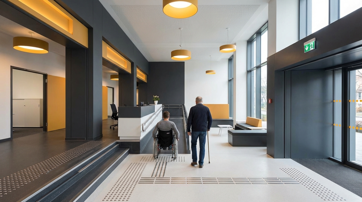
If you normally start by placing the reception desk, try flipping that. Start by drawing the accessible path:
- From accessible parking to main entrance.
- From entrance to reception or main service point.
- From there to restrooms, key services, and exits.
If the wheelchair user has to take “the long way around,” that is usually your first signal something is off.
Key technical anchors you should know (without memorizing the code book)
Here are some core measurements that show up again and again in ADA design. These are not every detail, but they anchor most decisions.
| Element | Typical ADA Requirement (2010 Standards) | Why it matters |
|---|---|---|
| Accessible route width | 36 inches minimum, 32 inches at doors | Allows most wheelchairs and mobility devices to pass. |
| Door clear width | 32 inches min clear opening, measured with door at 90 degrees | Prevents “almost fits” situations. |
| Ramp slope | 1:12 max (1 inch rise per 12 inches run) | Steeper ramps become unsafe, hard to climb. |
| Turning space | 60 inch diameter circle or T‑shaped space | Lets wheelchairs turn around, not get stuck. |
| Counter height (accessible portion) | 36 inches max above floor | Makes signing, paying, and talking possible while seated. |
| Grab bar height | 33 to 36 inches above floor | Consistent support for transfers and balance. |
| Reach range (side) | 48 inches max high, 15 inches min low | Guides placement of controls, switches, and card readers. |
| Clear floor space at fixtures | 30 x 48 inches min, oriented for forward or side approach | Supports wheelchairs positioning to use things. |
Keep a cheat sheet of these on your desk or whiteboard when you plan. You do not need to recite the whole standard, but these numbers affect corridor width, furniture layout, door choices, restroom size, and where tech panels go.
Accessible routes, entrances, and parking
Parking and site arrival
If your site has parking that you control, ADA requires accessible parking spaces and access aisles.
Key points:
- Number of spaces:
- 1 accessible space for 1-25 total spaces
- 2 for 26-50
- 3 for 51-75
- 4 for 76-100
- Continue per ADA table as count increases
- Van accessible: At least 1 of every 6 accessible spaces must be van accessible, with an 8‑foot access aisle and an 8‑foot space, or an 8‑foot aisle with an 11‑foot space, depending on your layout.
- Location: Accessible spaces must be the closest to the accessible entrance, along the accessible route, not blocked by curbs without curb ramps.
Add clear striping and signage, and pay attention to slope. Both the parking space and the access aisle need almost flat surfaces (max 1:48 cross slope). A tilted space can make transfers unsafe.
Entrances and doors
Your “main entrance” should be accessible. Using a back entrance as the only accessible entrance is risky and usually breaks the spirit of ADA.
Key checks:
- No steps on the accessible route. If there is a level change over 1/2 inch, you need a ramp or lift.
- Door width: 32 inches minimum clear when open at 90 degrees.
- Thresholds: 1/2 inch max, beveled edges if more than 1/4 inch.
- Door hardware: Lever handles or similar, operable with one hand, no tight grasping or twisting.
- Closer speed: Doors should not slam shut; closing speed needs to allow people to pass.
If you have multiple entrances, at least one must be accessible and connected to each accessible route in the building. For multi‑tenant buildings, the primary public entrance must work for everyone, not just certain suites.
Watch how people with strollers or delivery carts enter. If they struggle, you probably have accessibility problems too.
Ramps, stairs, and vertical circulation
Designing ramps that people actually feel safe using
Ramps can be functional or scary. The difference is usually slope, landings, and railings.
Core ramp rules:
- Maximum slope: 1:12. If you rise 30 inches, you need at least 30 feet of ramp.
- Maximum run: After 30 feet, add a level landing.
- Width: 36 inches minimum clear width between handrails.
- Landings: Level at top and bottom, at least 60 inches long, and at direction changes.
- Handrails: On both sides if rise is more than 6 inches; continuous gripping surface, mounted 34-38 inches above the ramp surface.
If your site has a steeper grade, consider regrading or adding switchbacks. Short, very steep ramps technically might work in some local codes but can cause falls and complaints.
Elevators and platform lifts
For multi‑story commercial spaces open to the public, you usually need an elevator if the building has more than three stories or more than 3,000 square feet on a story above or below grade. There are exceptions, but if you are planning for customers or patients upstairs, assume you need a real elevator.
A few elevator design notes linked to ADA:
- Car size: Enough space for a wheelchair to enter, turn, and exit (common size: 51 x 80 inches clear inside, but depend on local code and ADA diagrams).
- Controls: Braille and raised character labels; buttons at accessible reach range.
- Audible signals: Floors announced with audible signals; visual indicators for people with hearing loss.
Platform lifts are allowed in limited situations. For example, to access a small raised stage in a restaurant or a few steps in an existing building where a ramp would be unworkable. They come with strict requirements and maintenance needs.
Interior circulation: aisles, corridors, and layouts
Your layout should work for people using wheelchairs, scooters, walkers, crutches, or who simply need more space to move.
Key layout rules:
- Corridor width: 36 inches minimum clear, with passing spaces if long corridors are narrower than 60 inches.
- Aisles between shelves and displays: In retail, aim for at least 36 inches and more in heavy traffic zones.
- Turning spaces: A 60‑inch diameter turning circle or a T‑turn area in key points like end of aisles and near doors.
- Obstructions: Wall-mounted items that protrude 4 inches or less into the path between 27 and 80 inches above the floor; anything more can be a hazard to people with low vision.
Think about peak times. If you only design for an empty space, you will fail during your busy hours. That narrow gap next to a pillar might meet the code on paper, but once people stand in line there, it can block the path completely.
Walk your layout with a rolling chair or a cart before you lock it in. Where you get stuck, a wheelchair user might too.
Restrooms and changing areas
Restrooms are one of the most common ADA complaint areas. They have many detailed rules, but the big themes are clear:
Toilet compartments
Accessible toilet stalls need:
- Size: Typically 60 inches wide minimum, with enough depth (56 inches for wall‑hung toilets, 59 inches for floor‑mounted) for wheelchairs to enter and transfer.
- Door: 32 inches clear width, swing that does not block clear floor space for the toilet; door hardware easy to operate.
- Grab bars: Behind and on the side wall adjacent to the toilet, at 33-36 inches height.
- Toilet height: 17-19 inches to top of seat from finished floor.
Sinks and accessories
Lavatories and mirrors also have rules:
- Clear space: 30 x 48 inches clear floor space in front of the sink, allowing forward approach.
- Knee and toe clearance: Under-sink clearance for wheelchair users, with protective covering for hot pipes.
- Height: Rim or counter no higher than 34 inches.
- Faucet controls: Lever, push, or sensor types that do not require tight grasping or twisting.
- Mirrors: Bottom edge of reflective surface no higher than 40 inches above floor in at least one mirror.
- Accessories: Soap, towels, and dryers within accessible reach range (typically 48 inches max height).
Family and gender‑neutral restrooms
Single‑user restrooms can be a strong accessibility feature if done right. They help parents with children, people with personal care assistants, and many others.
To make them work for ADA:
- Provide the same clearances as a standard accessible restroom.
- Include grab bars, proper sink height, and accessible door hardware.
- Keep the space free of clutter and storage.
Counters, seating, and service areas
Sales and service counters
If you collect payments, give tickets, or share paperwork at a counter, part of that counter must be accessible.
Common requirements:
- Height: 36 inches max above floor for at least part of the length.
- Length: 36 inches minimum length of accessible counter surface (some exceptions have 30 inches).
- Approach: Clear floor space in front, with no barriers like fixed trash bins blocking access.
If your counter is tall for standing people, add a lower adjacent section. Label it clearly so customers know it exists.
Tables and seating
Restaurants, cafes, coworking areas, and training rooms need accessible seating.
Guidelines:
- Number: At least 5 percent of seating or at least one table (whichever is greater) must be accessible.
- Knee and toe clearance: At least 27 inches high, 30 inches wide, 19 inches deep under the table.
- Approach: Accessible route to seating, no tight turns blocked by chair placement.
- Distribution: Do not cluster accessible tables in a far corner. Spread them around in different price points and views.
For fixed seating like auditoriums:
- Accessible seating with clear floor area for wheelchairs.
- Companion seating next to accessible spaces.
- Good lines of sight to screens or stages, including when people in front stand.
If all your accessible seats have the worst view, people will notice, even if the code is technically met.
Signage, lighting, and sensory experiences
Accessible signage
Signage is about both location and format.
For rooms and spaces that are permanent (like restrooms, exits, room numbers):
- Tactile characters: Raised letters and Braille.
- Contrast: Light characters on dark background or the reverse; avoid low contrast combinations.
- Location: On the latch side of doors, at a consistent height (often 48-60 inches to baseline of characters; check ADA diagrams).
Directional signs (like arrows to restrooms or elevators) do not always have the same tactile requirements, but they should still be clear, consistent, and large enough to read.
Lighting and glare
Accessibility is not just brightness. Too much glare can hurt people with low vision, migraines, or sensory sensitivity.
Think about:
- Even, indirect light along accessible routes and task areas.
- Limited harsh contrast between dark and light zones.
- Controls that support people with sensory needs, such as dimming in certain rooms or zones.
Sound and sensory load
For customers with hearing loss or sensory sensitivity, your space can either welcome or overwhelm.
Consider:
- Induction loops or assistive listening systems in meeting rooms, theaters, and counters with fixed microphones.
- Acoustic treatment in large echo‑prone spaces to keep speech understandable.
- Quieter zones in restaurants, clinics, and coworking where people can wait or work if they are sensitive to noise.
Digital and technology accessibility inside physical spaces
Many commercial spaces now rely on technology to deliver service:
- Self‑service kiosks
- Digital check‑in tablets
- Digital menu boards
- Room booking panels
- Smart locks and card readers
- Wayfinding apps
The ADA language for digital is less explicit than for ramps, but enforcement trends are clear: if your tech is part of how customers access your services, it should be accessible.
Kiosks and check‑in systems
Design kiosks as if you are designing a small workstation:
- Height and reach: Screens, keyboards, and card readers inside accessible reach ranges (15-48 inches from the floor for forward reach, maybe slightly less for side reach constraints).
- Clear floor space: 30 x 48 inches in front or next to the kiosk for wheelchair users.
- Input methods:
- Keyboard navigation (not only touch gestures).
- Audio output with headphone jack or hearing‑aid compatible mode.
- Large, high‑contrast text.
- Alternative option: If a kiosk is not fully accessible, provide equivalent service at a staffed desk without extra burden.
Websites and apps tied to physical spaces
If someone must use a website or app to make a reservation, book a room, or check in, that digital interface connects directly to your physical accessibility.
Aim for compliance with WCAG 2.1 Level AA:
- Text alternatives for images.
- Keyboard access to all functionality.
- Enough color contrast between text and background.
- Captions on video content.
- Clear, consistent navigation and labels.
Here is where tech and physical design meet: if you place a QR code for a “digital menu” at tables, you still need at least one accessible way to view the menu for people without smartphones or with assistive tech that does not work well with your site.
Legal risk, audits, and common mistakes
Frequent ADA problems in commercial spaces
In real audits and lawsuits, the same issues show up over and over:
- Ramps that are too steep or have no handrails.
- Parking lots with faded striping or missing van spaces.
- Restroom grab bars in wrong positions or missing altogether.
- Heavy doors without accessible openers on key entrances.
- Sales counters with no accessible section.
- Tables and chairs squeezed so tightly that routes are blocked.
- Signs without Braille or tactile characters at restrooms.
- Websites that do not work with screen readers while being tightly tied to services.
Most of these are not design marvels. They are small details someone did not check or someone changed during build‑out.
How to audit your space
You do not have to guess. There are structured ways to see where you stand:
- Hire an accessibility consultant: Many architects and code experts specialize in ADA. They will walk your space with measurement tools and checklists.
- Use DOJ checklists: The U.S. Department of Justice has ADA checklists for existing facilities. They are not perfect, but they cover many basics.
- Test with users: Invite people with disabilities to walk through your space and give feedback. Compensate them for their time.
For digital audits:
- Combine automated testing tools with manual checks.
- Test with screen readers (such as NVDA or VoiceOver), only a keyboard, and zoomed text.
- Document gaps and prioritize fixes that block access the most.
An ADA audit is less about passing one test and more about building the habit of regularly asking: “Who gets left out here?”
Working with architects, contractors, and tech vendors
ADA compliance is a team effort. If your vendors do not understand it, you carry the risk.
What to ask your architect and contractor
During design:
- Ask which parts of the 2010 ADA Standards they are using for your project.
- Request marked‑up plans showing accessible routes, turning spaces, and clearances.
- Review restroom layouts and entrance details early, not at the last minute.
During construction:
- Confirm that any field changes still keep required widths and clearances.
- Inspect slopes with proper tools, not by eye.
- Verify mounting heights for grab bars, signage, switches, and controls before walls close.
What to ask your tech partners
For any digital or device‑based element in your space:
- Ask if their product meets WCAG 2.1 AA for relevant parts (for example, software UI).
- Request documentation about accessibility features and known gaps.
- Test devices in realistic conditions with screen readers and switch controls where possible.
If a partner says “we will add accessibility later,” treat that as a risk flag. Retrofitting software is possible but usually takes more time and budget than doing basic accessibility up front.
Operational practices: keeping accessibility alive after opening
Design is half the story. Daily operations can make or break accessibility.
Training your staff
Your team needs clear, simple guidance:
- Do not store boxes, signs, or carts in accessible routes, ramps, or in front of accessible doors.
- Keep accessible seating and counters available, not covered with displays or “temporary” equipment.
- Know where accessible restrooms are and how to guide customers there.
- Understand how to assist customers who request help with doors, devices, or reading printed material.
Brief trainings during onboarding help. Even a 20‑minute walkthrough with photos of “do” and “do not” setups can prevent many problems.
Maintenance routines
Embed accessibility checks into your regular maintenance:
- Check parking striping and signage twice a year.
- Test door closers and automatic openers on a schedule.
- Inspect ramps and walkways for cracks or heaving that create tripping hazards.
- Review restrooms for loose grab bars, broken locks, or blocked clearances.
For digital systems:
- Re‑test key workflows (booking, ordering, check‑in) after major updates.
- Log and respond to user reports about accessibility barriers.
Accessibility as better customer experience
You are running a business, not just checking boxes. The good news is that many ADA‑guided changes improve experience for everyone.
A few examples:
- Wider aisles help wheelchairs and also parents with strollers and people with shopping carts.
- Clear, high‑contrast signage helps older adults and anyone unfamiliar with the building.
- Quiet waiting areas help customers with sensory sensitivity and anyone stressed or tired.
- Accessible websites convert more mobile visitors and people on slow connections.
When you track metrics like dwell time, conversion rate in a retail store, or reduced no‑shows in a clinic, you will often see gains when the space is easier to navigate.
Practical design checklist you can act on today
To bring all of this into something you can move on quickly, here is a simple, practical checklist. Use it to review a new design or an existing space.
Site and entrance
- Do you have the right number of accessible parking spaces, including van spaces, correctly striped and signed?
- Is there at least one step‑free accessible route from parking and sidewalk to the main entrance?
- Are ramps at or below 1:12 slope, with handrails and landings?
- Does your main entrance door have a 32‑inch clear width, low threshold, and easy‑to‑use handles?
Interior circulation
- Are corridors and key aisles at least 36 inches wide, even when customers are present?
- Are routes kept clear of storage, displays, and temporary items?
- Can a wheelchair user get from entrance to reception, restrooms, and main services without backtracking or staff‑only detours?
Restrooms
- Is there at least one accessible restroom or toilet compartment on each floor serving the public?
- Are grab bars in the correct locations and solidly mounted?
- Are sinks at proper height with knee space, and are pipes protected?
- Are soap, towel dispensers, and dryers within reach for seated users?
Counters, seating, and service
- Does each sales or service counter have an accessible section at 36 inches or less with enough length?
- Do you have accessible seating locations distributed in your main areas (restaurant floor, meeting rooms, waiting areas)?
- Is at least one path to each cluster of seating accessible?
Signage and sensory environment
- Do permanent rooms (restrooms, exits, room numbers) have tactile and Braille signage at consistent locations?
- Is lighting even, with limited glare at entrances, counters, and signage?
- Do you have assistive listening systems where sound is essential to your service?
Technology and digital touchpoints
- Are kiosks, check‑in tablets, and card readers within reach for seated users, with clear floor space?
- Can users complete essential flows (booking, ordering, check‑in) on your website or app with a keyboard and screen reader?
- Do you provide non‑digital alternatives when tech fails or is not accessible to a customer?
If this feels like a lot, pick one zone of your space and focus just on that this week. For example, start with the path from parking to reception. Measure widths and slopes, watch customers move through, and take notes. Then fix one thing you find.