So, you are trying to figure out how to use custom logos in floor designs to boost your branding and not make your space look like a giant ad. The short answer is: place your logo in high-traffic zones, keep the design simple, and match the floor material and colors to your brand and the way people actually move through the space.
You use flooring for branding when the logo supports the experience, not when it screams for attention. When the floor quietly reminds people where they are, guides them, and looks good in photos, it starts paying for itself in awareness, memorability, and even conversions if you are in retail or events.
Things you need to know:
- Logo floors work best in entrances, reception, checkout, event stages, and photo spots.
- Simplicity is key: too much detail gets lost once people walk over it.
- Material choice matters: vinyl, resin, tile, carpet, wood all behave very differently.
- Contrast and lighting change how readable your logo is from a distance.
- Wayfinding and zoning with floor graphics can direct people without more signs.
- Installation and maintenance will decide whether it looks sharp or tired in six months.
- You need vector artwork and often a slightly adjusted logo for flooring use.
- Measure real impact with foot traffic, dwell time, and content (photos, videos) your visitors share.
> Good floor branding does not start with “Where can we put the logo?”
> It starts with “What do we want people to feel and do as they move through this space?”
> Think of the floor as your quietest, most consistent ad placement.
> People walk on it all day, even when they ignore your walls.
> If your logo looks great on a phone camera from standing height, it will do real work for your brand.
> When you see people taking photos on your logo, you know your floor is doing more than just covering concrete.
> A floor that supports your brand can fix weak signage, bad flow, and confusing spaces faster than another wall graphic.
Why floors are underrated branding real estate
Most brands go straight to walls, screens, and signage. The floor is an afterthought. That is a missed opportunity.
People constantly look down. They check their path, avoid collisions, glance at their phone, then back to the floor. That slight downward gaze is built into how humans move. If your logo and brand cues are “underfoot,” you are playing where attention naturally goes.
A few ways floor branding quietly works for you:
- High exposure: Every person walking through sees the floor, even if only in their peripheral vision.
- No extra clutter: You are using space that already exists, instead of adding more signs to the visual noise.
- Photo backdrop: Logos and patterns show up in social content without asking. That can extend your reach fast in retail and events.
- Context reminder: When people think “Where am I?” and glance down, your brand is right there.
If you run a tech brand, showroom, co-working space, or event, this matters a lot. You want every square meter to support the story: modern, trusted, clear, and easy to navigate.
When a logo floor makes sense (and when it does not)
A custom logo floor is not for every space. Sometimes a neutral floor and strong wall branding works better.
Good fits for floor logos
- Reception and lobbies: People pause, check in, look around. A center logo anchors the space.
- Retail entry zones: First 5-10 steps set the tone and strengthen brand recall.
- Trade shows and booths: Floor logos help people remember where they stopped and which stand they liked.
- Tech offices and meeting areas: Floor branding can zone areas like “engineering,” “product,” or “labs” in a subtle way.
- Event stages and photo walls: Floor logos appear in almost every stage photo or video shot from the audience.
- Fitness and esports spaces: Center logos on courts, arenas, or gaming zones create identity and a “home turf” feel.
When you should skip the logo on the floor
You might not want a logo floor if:
- The space is extremely small, and a big logo would overwhelm it.
- Your logo has tiny details or thin lines that will not read well at a distance.
- You have heritage floors (old wood, stone, or terrazzo) that are already a visual asset.
- You run a quiet, clinical, or serious environment where branding must stay very soft.
In those cases, you can still brand through floor color, pattern, and zoning instead of a literal logo.
Where to place custom logos on the floor
Placement is where most brands either win or lose with floor design.
1. Entrances and thresholds
The entrance is your first chance to say “You are in the right place.”
Common options:
- Entry medallion: A circular or square logo set a few steps inside the door.
- Transition strip logo: Logo placed where outdoor flooring meets your interior surface.
- Doormat plus interior echo: Logo mat outside, smaller or simplified logo right past the threshold.
Practical tips:
- Keep it large enough to be readable from outside if you have glass doors.
- Leave “breathing room” around the logo so it does not crowd the walls or furniture.
- Think about wet shoes and dirt. Use finishes that handle moisture and cleaning.
2. Reception and check-in
Reception is where people wait, scan the room, and talk. Perfect for subtle but strong branding.
You can:
- Center the logo under or in front of the desk.
- Align the logo with a light fixture or ceiling feature above.
- Use a soft inset carpet with the logo in a hard surfacing lobby.
If you work with tech clients or visitors, this area often shows up on LinkedIn photos. You want the logo visible, but not so large that it looks like a sponsor board.
3. Pathways and wayfinding
Floor logos do not have to sit still. They can guide.
Examples:
- Small icon versions of your logo marking the path to demo areas or conference rooms.
- Colored stripes drawn from the logo, leading visitors to different zones (support, sales, lounge).
- Logotype plus arrows on vinyl strips for events and pop-up spaces.
> If people stop, look around, and say “Where is the demo area?”
> The floor can answer before your staff has to.
4. Zones and “brand moments”
Sometimes you want a branded floor only in small pockets:
- A logo under a long table in a co-working area.
- A branded circle for VR or AR demos.
- A “founder story” corner with a timeline on walls and a logo on the floor in the center.
- A quiet recording or podcast booth with subtle logo inlay just inside the door.
These spots become “moments” people remember and photograph.
5. Stages and content areas
If you host events, panels, product launches, or training sessions, the stage floor is prime branding space.
Ideas:
- Logo centered where speakers stand.
- Secondary mark or initials on the front edge of the stage.
- Pattern inspired by your logo spreading from the stage into the audience floor.
Check camera framing: stand where a photographer would stand, hold a phone horizontally, and see what shows up in the shot. Adjust size and position from there.
Choosing the right flooring material for a logo
Material choice affects cost, durability, color fidelity, and maintenance. This is where tech brands sometimes overcomplicate things with exotic surfaces that are hard to maintain.
Here is a comparison:
| Material | Where it fits | Logo detail level | Durability | Notes |
|---|---|---|---|---|
| Luxury vinyl tile (LVT) / sheet vinyl | Offices, retail, events | Medium to high | High | Good color, budget friendly, easy to clean |
| Epoxy / resin floors | Labs, tech spaces, showrooms | High | Very high | Logos can be embedded under clear coat |
| Porcelain / ceramic tile | Entrances, lobbies | Medium | Very high | Good for inlaid or printed logos, tough to change |
| Polished concrete with stain | Industrial, loft, tech hubs | Low to medium | High | Better for simple shapes, lower color accuracy |
| Carpet tile / broadloom | Offices, meeting rooms | Medium | Medium | Works best with simplified, larger logos |
| Wood / engineered wood | Executive, boutique retail | Low to medium | Medium | Logo via inlay or stain; more craft, more cost |
| Temporary vinyl graphics | Events, trade shows | High | Short term | Fast install, fully removable |
Vinyl (LVT and sheet)
Vinyl is one of the most common choices for logo floors, especially in tech offices and retail.
Pros:
- Good color reproduction.
- Many vendors offer custom-printed sections with logos baked in.
- Reasonable cost and quick installation.
- Comfortable to walk on.
Watch out for:
- Seams: plan logo orientation so seams do not cut through the mark if possible.
- Gloss: very shiny surfaces show scratches and glare, which can hide the logo.
Epoxy / resin floors
Epoxy is common in labs, garages, and high-traffic tech spaces. It can look very clean and bright.
You can place a printed logo on the base layer and seal it under a clear epoxy topcoat. That protects it from wear and gives a flat, smooth surface.
Pros:
- Very durable, good for heavy foot traffic and equipment.
- Logo is protected under the surface.
- Large uninterrupted areas are possible.
Cons:
- Professional installation needed.
- Harder to change later.
- Can be slippery if the wrong finish is chosen.
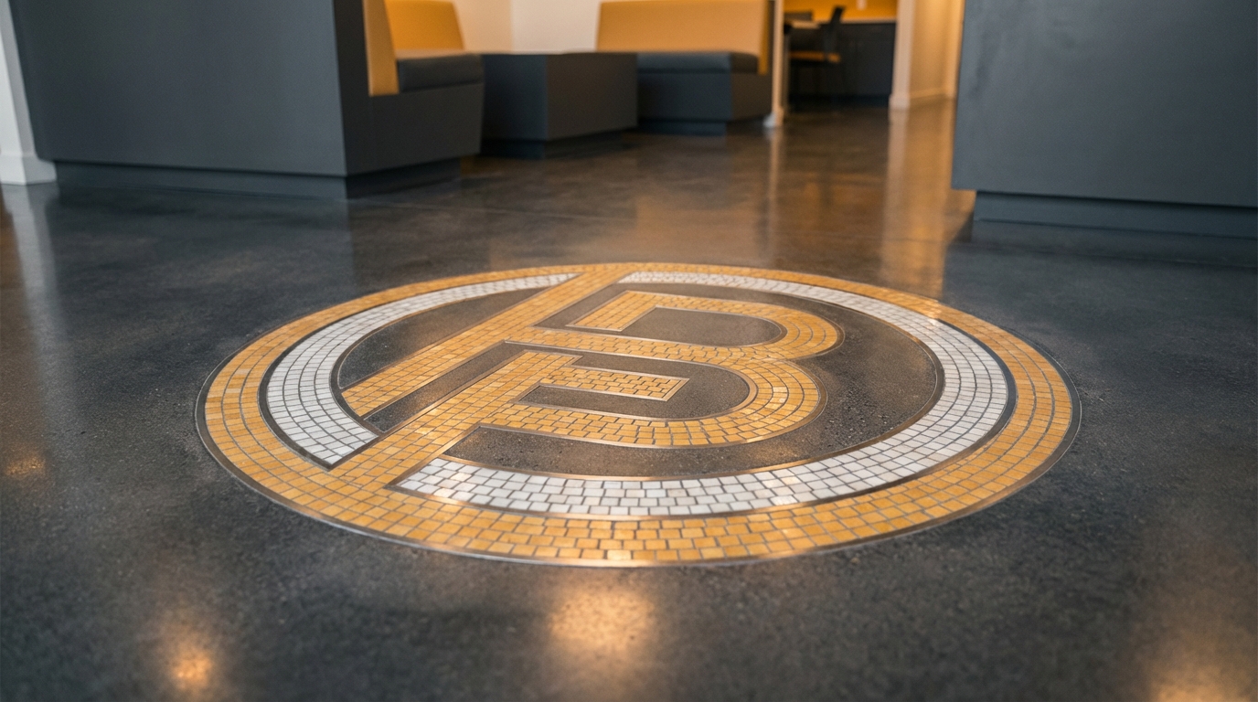
Porcelain and ceramic tile
With tile, you have two paths:
- Pre-printed tiles with parts of your logo assembled like a puzzle.
- Cut pieces (waterjet) that form your mark as an inlay.
Good for entry lobbies that need high durability and a strong first impression. Expect higher cost and longer lead time.
Carpet and carpet tile
Carpet tiles with logo patterns are very common in corporate spaces. The trick is to keep the design bold, with thick shapes.
Practical points:
- Use darker colors on the main walking routes to hide wear.
- Place logos in inset “rugs” in lower-traffic zones for better longevity.
- Plan tile layout so that replacement is easy if a tile is damaged.
Temporary graphics for events
For conferences, pop-ups, or product launches, temporary floor graphics are your friend.
You can print a high-resolution logo on adhesive vinyl rated for floors, with an anti-slip laminate. They go down fast and come up clean.
Use them to:
- Brand an event entrance on neutral floors you do not control.
- Create “paths” to your booth across a show floor.
- Add logos on stages where you cannot alter the permanent surface.
Designing a logo for floor use
Your existing logo might not work straight away as a floor graphic. The context changes how it reads.
1. Simplify the shape
On the floor, you view the logo from a steep angle, often with people or furniture partly blocking it. Fine details get lost.
Guidelines:
- Remove small taglines or very thin lines.
- Use a single color or two-color version where possible.
- Avoid very small inner gaps that could fill with dirt or blur in printing.
> If you cannot recognize the logo from a blurry phone photo taken while walking, it is too complex for the floor.
2. Scale for viewing distance
Think about where people first see the logo:
- Entry: 2-6 meters away.
- Stage: 5-20 meters away, plus camera distance.
- Reception: 1-4 meters while standing.
As a rough rule, many installers suggest the shortest dimension of the logo (height or width) should be at least one-tenth of the typical viewing distance in millimeters.
Example: If common viewing distance is 5 meters (5000 mm), the logo should be at least 500 mm (0.5 m) in its smaller dimension. For more impact in branding spaces, you might go larger.
3. Contrast and color choices
Floors often sit in less direct light than walls. That lowers contrast.
Helpful moves:
- Use strong contrast between logo and background (light on dark, dark on light).
- Avoid colors that match shoes or typical dirt tones, which reduces clarity.
- Check samples under your real lighting, not just in the design software.
If your brand color is very close to a gray or a muted tone, consider adding an outline or “keyline” around the logo to separate it from the floor.
4. Orientation and rotation
One tricky detail: from which direction should the logo face?
Think about:
- Main entry direction.
- Camera direction (for stages and photo zones).
- People walking versus people sitting.
Sometimes you choose one primary orientation and accept that from some angles, the logo will be sideways. That is fine as long as from the key angle (entry or camera) it feels right.
5. File formats and production
Your flooring vendor will need:
- Vector artwork: SVG, EPS, or AI.
- Color references: Pantone or CMYK targets.
- Clear instructions for size, orientation, and placement.
If your logo will be cut from material (tile, vinyl, wood inlay), avoid gradients and very tight inside corners. If printed, almost anything goes, but you still face wear and dirt, so simple still wins.
Balancing branding with user experience
Floor design must respect how people move and feel in your space.
Safety and slip resistance
You cannot trade safety for branding. That is non-negotiable.
Points to check:
- Every material and graphic laminate must meet slip resistance standards suitable for the space.
- Glossy finishes might look sharp in renders, but in real life they can glare and get slippery when wet.
- Raised or textured logos should not create trip points.
Ask your installer for slip ratings and how those change when the surface gets wet.
Accessibility
Floor graphics should support, not block, accessibility.
Good practices:
- Avoid high-contrast stripes that can confuse people with visual sensitivities.
- Do not create patterns that mimic steps or drops.
- Leave clear, plain routes for wheelchairs and people using aids.
You can also use floor contrast to support navigation for visitors with low vision. For example, a slightly darker zone leading to reception or lifts.
Comfort and cognitive load
Too much visual noise on the floor causes fatigue. People like some visual rest.
So:
- Use branded zones, not an all-over logo or busy pattern everywhere.
- Keep heavy branding where it supports a task: reception, orientation, wayfinding.
- Contrast those zones with calmer, low-detail surfaces in focus areas like desks and quiet rooms.
> A good rule: if people have to think hard in a space, give their eyes a calmer floor.
> Put your loudest branding in social and transition areas.
Using floor logos for wayfinding and flow
Wayfinding is where you can connect branding and usability in a direct way.
Color-coded paths
Pick brand colors and assign them to paths:
- Blue route: meeting rooms.
- Green route: cafeteria and lounge.
- Orange route: product demo zones.
You do not need to flood the floor with solid color. You can run colored bands or repeated logo icons every few meters.
Combine with signage:
- Same color appears on door signs, hanging signs, and maps.
- Floor logo at entry to each zone to confirm “You are here.”
Checkpoint logos
Small logo markers at key points can guide and reassure:
- A logo badge at the start and end of a long corridor.
- Logo plus text like “Reception this way” or “Demo area” printed on vinyl tiles.
- Icons from your brand family (not the full logo) for bathrooms, lifts, and stairs.
This works especially well in large tech campuses where people easily get lost.
Queue and crowd management
Floor graphics already manage queues in airports and stores. Tie that to your brand.
Examples:
- Logo repeated in the queue line with short microcopy: “Check-in,” “Support,” “Pickup.”
- Numbered or labeled spots with subtle logos for appointment-based services.
- In events, sponsor or host logo at waiting points where people stand for long periods.
People stare at the floor when they wait. That is time with your brand.
Measuring if your logo floor is actually working
If you are a tech-focused brand, you probably want more than “It looks good.” You want data.
Here are practical ways to check impact.
1. Foot traffic and dwell time
Use:
- Overhead people counters.
- Computer vision (anonymized) heatmaps.
- Basic observation, if budget is small.
Questions to answer:
- Do people slow down, pause, or gather near the logo area?
- Does the branded floor path keep people on the intended route?
- Are there bottlenecks caused by logo placement?
2. Content and social mentions
Search your brand name or event hashtag and check photos:
- How often does your floor logo appear in user-generated photos and videos?
- Are people taking deliberate shots on or near the logo?
- Do creators frame the floor when doing unboxing, product demos, or interviews in your space?
If you see your logo floor in a high percentage of content from that venue, you are getting extra impressions basically for free.
3. Surveys and interviews
Short questions work:
- “What details do you remember from the entrance area?”
- “Did you find it easy to find reception / demo area / exit?”
- “How would you describe the atmosphere of our space in a few words?”
If words related to your brand values show up a lot, your environment, including floors, is doing its job.
4. Business outcomes
Connect your floor branding to actual goals:
- Retail: compare conversions and basket size before and after a remodel that added branded floors.
- Events: measure booth visits and dwell time at stands with floor logos vs those without.
- Hiring: ask candidates how they felt walking into your office, and whether it matched what they saw online.
You will not isolate floor design completely, but you can see trends when floor branding is part of a broader refresh.
Costs, installation, and practical constraints
Floor logos live at the edge of branding and construction. That means you deal with budgets, schedules, and building limits.
Cost drivers
Main things that affect cost:
- Material type and quality.
- Area size and logo complexity.
- Type of logo execution (printed, cut-in, stained, or inlaid).
- Subfloor condition and prep work needed.
- Access restrictions and working hours.
To give ballpark ranges (these are broad and vary by region):
| Type | Approx cost impact vs plain floor |
|---|---|
| Printed vinyl logo panel | Low to medium |
| Epoxy floor with embedded logo | Medium to high |
| Tile floor with waterjet logo inlay | High |
| Carpet tile with custom logo section | Low to medium |
| Temporary event vinyl graphics | Low |
Installation timing
If you are building new or doing a major remodel, you want to lock logo placement early so other trades can work around it.
Sequence often looks like:
- Concept design and brand alignment.
- Material choice and samples.
- Logo layout and sizing on scaled plans.
- Approval, file prep, and vendor coordination.
- Subfloor prep and base layers.
- Logo install and finishing coats or sealers.
For existing spaces, expect to phase work at night or weekends, especially in offices or stores that cannot close.
Maintenance and lifespan
Your floor logo is only as good as it looks on a normal Tuesday after six months of use.
Plan for:
- Clear cleaning instructions for staff and contractors.
- Approved cleaning products that do not fade or cloud the logo.
- Protective entrance mats in bad weather, even if they cover the logo at times.
- Touch-up options: extra tiles, patch kits, or spare printed panels.
> A floor that looks tired signals a tired brand.
> Build maintenance into your branding plan at the start.
Branding underfoot in tech spaces
Since your niche is technology, let us talk about specific patterns that work well in tech-driven spaces.
1. Product-focused demo zones
If you run hardware, IoT, or smart home products, you can use the floor to “stage” your story.
Ideas:
- Logo circle where people place a device on the floor for testing or AR experiences.
- Printed circuit-like lines coming out of the logo and pointing to devices or info panels.
- Zoned areas with color blocks from your brand palette under each category of product.
This creates a physical layer that echoes what users see in your UI or marketing.
2. Developer hubs and co-working
Developers care about function and clarity. Overly loud branding can feel fake.
Stronger approach:
- Muted base floor with occasional, well-placed logos at intersections and community spots.
- Simple icons on the floor that match your product icon style for meeting rooms, focus pods, and collaboration spaces.
- Subtle “easter egg” logos in carpets in lounge zones, not in serious work areas.
Let the quality of the chairs, light, and acoustics do most of the talking. Floor branding just helps with wayfinding and identity.
3. Esports, gaming, and media studios
These spaces can support bolder floor statements:
- Large central logo at the center of the arena or main stage.
- High-contrast stripes leading from entry to player zones.
- Secondary marks on the floor in photo or streaming corners.
Here, the test is video: view your space layout through a live camera feed and see how the floor reads with RGB lighting and movement.
4. Corporate HQ and client centers
In B2B tech offices, logo floors need to balance brand strength with trust.
Good pattern:
- Strong, clear logo in the main lobby floor.
- More subtle, small marks or color-blocked carpets in internal zones.
- No logos in quiet rooms and minimal presence in boardrooms, just a small mark near entry or reception inside that floor.
Your visitors should feel guided and confident, not bombarded.
Common mistakes with logo floors (and how to avoid them)
1. Logo too small or too detailed
If people have to squint or step back to read it, it is not helping.
Fix:
- Scale up and simplify to a strong mark or initials.
- Remove taglines and extra text from the floor version.
2. Wrong placement relative to doors and furniture
A beautiful logo under a couch or half-hidden by a reception desk wastes your spend.
Fix:
- Draw furniture and doors on the plan and overlay logo placements.
- Check alignments at full scale with tape on the subfloor before installation.
3. Poor contrast and glare
If the logo and background are too close in tone, or light reflection hides it, the impact drops.
Fix:
- Boost contrast and tweak colors or outlines.
- Pick a matte or satin finish, not high gloss in high-light areas.
4. Ignoring the building’s character
Sometimes the space has a strong material story already: brick, stone, wood. A loud plastic-looking logo floor could feel wrong.
Fix:
- Match tone and warmth of existing surfaces.
- Consider inlay or stain for a more integrated look.
- Keep the logo small and placed near modern elements like screens or check-in kiosks.
5. No plan for changes
Your brand might evolve. A permanent inlay locked into expensive stone can become a problem.
Fix:
- Use more permanent solutions for symbols unlikely to change (icon) and flexible graphics for logotypes and taglines.
- Install logos in areas where replacing a section later is realistic, like tiles or modular panels.
A quick process to get your first branded floor right
If you want a simple roadmap, here is a lean sequence you can follow.
Step 1: Define the purpose
Write down one main goal:
- “Reinforce brand at entry.”
- “Guide visitors to reception without extra staff.”
- “Increase shareable photo moments at events.”
Everything flows from that.
Step 2: Map your space
On a plan or even a rough sketch:
- Mark entrances, exits, reception, main paths, and key content areas.
- Note where people naturally stop or queue.
- Circle 2-3 “high-value” spots where a logo on the floor could help.
Step 3: Choose material + logo format
Pick:
- The base flooring you already have or plan to install.
- Whether the logo will be printed, inlaid, stained, or added as a graphic.
- The simplified version of your logo suited for floor use.
Gather references of spaces you like; share those with your designer and installer.
Step 4: Test at full scale
Before committing:
- Tape out the shape of the logo on the actual floor.
- Print a low-cost paper or vinyl mockup and place it where it will go.
- Walk around, take photos from real viewing points.
You will catch sizing and orientation issues early.
Step 5: Install, observe, adjust
After installation:
- Watch how people move for a week or two.
- Listen for comments about navigation or feel.
- Add supporting wall signs or digital cues if there is still confusion.
Then refine your next project based on what you learned.
Here is one practical tip you can use right away: before you pay for anything, print your logo at the planned floor size on cheap paper, lay it on the ground where you want it, and walk the path your visitors will take, phone in hand. If you cannot read it comfortably on your phone screen from natural walking distance, make it bigger or simpler before you spend a single dollar on permanent flooring.