So, you are trying to figure out if the return of terrazzo is retro cool or already dated. It is retro cool right now, but it can look dated fast if you copy short‑lived trends instead of thinking long term.
The short version: terrazzo has real history, real performance, and real character, which gives it staying power. The problem is not terrazzo itself. The problem is trend overload on Instagram and TikTok. When brands push loud terrazzo patterns onto every surface and product, it starts to feel like a fad. If you focus on classic color palettes, good proportions, and the right context, terrazzo feels fresh instead of tired.
Here are a few things you need to know before you commit to terrazzo in your space or your product:
- Terrazzo is over 500 years old and was used long before it became a Pinterest trend.
- It comes in traditional cement, epoxy, and newer hybrid formats like tiles, slabs, and vinyl sheets.
- Muted, low‑contrast terrazzo tends to age better than high‑contrast, candy‑color designs.
- Big permanent surfaces (floors, countertops) need timeless choices more than small decor items.
- Terrazzo patterns are now printed on everything from phone cases to UI backgrounds, which speeds up trend fatigue.
- Real terrazzo has technical pros and cons: strong, low maintenance when installed right, but not cheap.
- Your lighting, surrounding materials, and color scheme decide if it feels “retro cool” or “stuck in 2018.”
Now, let us break this down in a practical way, like you and I are walking through a space and trying to decide what will still look good in five or ten years.
What terrazzo actually is (and why people keep coming back to it)
So, you are looking at terrazzo and wondering what the big deal is. Terrazzo is a composite material: chips of marble, quartz, glass, or stone are set into a binder (cement or resin), cured, then ground and polished to a flat, smooth surface.
That is the simple definition. The reason designers and architects keep coming back to it is a bit deeper.
You get:
- Visual texture without a repeating pattern like tile.
- Custom colors and chip mixes, from subtle to loud.
- Long life span when installed and sealed correctly.
It started as a “waste solution” in Venice. Workers took offcuts of marble, pressed them into clay or cement, and polished them. Over centuries, it moved into public buildings, airports, schools, and high‑traffic spaces because it held up.
> “Terrazzo’s strongest selling point is not that it is trendy. It is that it has already survived several trend cycles.”
So if the base material has that much history, why do people already ask if it feels dated? That brings us to how the trend came back.
Why terrazzo came back so hard in the 2010s
So, you are wondering why terrazzo suddenly showed up everywhere again. The short answer is: social media and a search for “warm minimalism” after too much cold, gray, industrial design.
Designers wanted something:
- Calm, but not boring.
- Colorful, but not chaotic.
- Playful, but still grown up.
Terrazzo checked those boxes. It felt nostalgic without being full mid‑century kitsch. It photographed well. It worked in flat lays, interior shots, product mockups, app backgrounds.
Then something predictable happened.
> “Once a pattern becomes a graphic motif instead of just a material, trend fatigue hits much faster.”
You started to see terrazzo:
- On notebook covers and phone cases.
- As wallpaper and peel‑and‑stick everything.
- As UI backgrounds in pitches, slides, and websites.
- Printed on plastic kitchenware and disposable items.
The same visual idea spread far outside floors and countertops. And when a material shows up everywhere in digital form, people start asking if it is already over.
Retro cool vs dated: what actually makes the difference
So, you are trying to draw the line: when does terrazzo feel retro cool, and when does it feel like a leftover Pinterest board from a few years ago?
I like to break it into four things:
- Color and contrast.
- Scale of chips and pattern.
- Where you use it (context).
- How permanent that use is.
1. Color and contrast decide 80 percent of the vibe
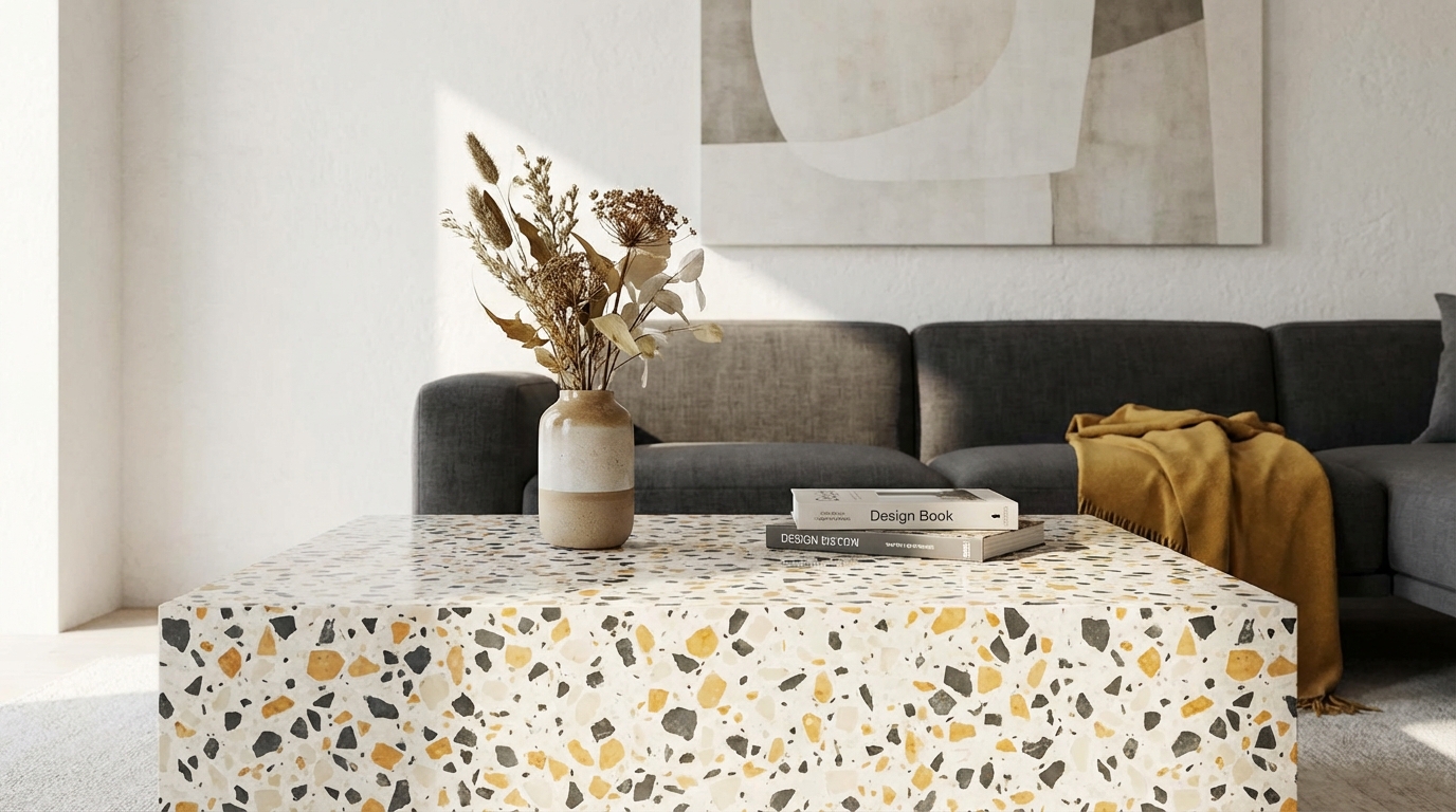
Muted terrazzo in natural stone colors tends to age better. Loud terrazzo with saturated chips on a crisp white base feels very “trend era.”
Here is a simple comparison:
| Style | Look | Ageing risk | Where it works best |
|---|---|---|---|
| Low contrast, neutral base | Beige/gray base, stone chips close in tone | Low | Floors, countertops, commercial spaces |
| Medium contrast, earthy colors | Warm base, terracotta/olive/charcoal chips | Medium | Cafés, feature walls, reception desks |
| High contrast, bright colors | White base, teal/pink/mustard chips | High | Small products, temporary decor |
| Monochrome terrazzo | Black, white, or gray chips on matching base | Low to medium | Modern homes, offices, galleries |
If your goal is “this still looks good in 8 years,” lean toward the first or fourth row. If your goal is “get attention for the next 18 months,” the high‑contrast, bright mix has its place.
> “Most people do not get tired of stone colors. They get tired of candy colors.”
So, before you decide if terrazzo is dated, look at the color story you are reacting to.
2. Chip scale changes the character a lot
People talk about color more than chip size, but scale matters on a gut level. Big chips feel bolder and more graphic. Tiny chips feel more like subtle grain.
You can think of it like pixel size:
- Small chips (1 to 5 mm) read like a fine, almost speckled texture.
- Medium chips (5 to 15 mm) give the classic “Venetian” terrazzo look.
- Large chips (15 mm and up) start to feel more like inlaid stone pieces.
Here is how scale tends to influence “cool vs dated”:
| Chip size | Impression | Trend risk |
|---|---|---|
| Small | Soft, background texture | Low |
| Medium | Recognizable terrazzo, balanced | Medium |
| Large | Bold, graphic, very “designed” | High |
If you pair large chips with bright colors, you get a look that is very date‑stamped. Not bad, just specific. If you choose small chips in a tight color range, the surface recedes a bit, which helps it age quietly.
3. Context: what is next to your terrazzo matters
So, you are wondering why the same terrazzo looks timeless in one space and out of place in another. The answer is the neighbors. Materials never live alone.
Think about:
- Wall colors.
- Cabinet finishes.
- Metal details (black, brass, chrome, etc.).
- Furniture lines (very curvy vs very sharp).
A few examples:
- Terrazzo + flat white everything + pastel chairs: This pairing ties your space to a narrow trend period. Very “Instagram café from a few years back.”
- Terrazzo + warm timber + off‑white paint + simple lighting: This combination feels calmer and less tied to a single year.
- Terrazzo + saturated wall color + black metal: Strong, but you need to be ready to repaint if you get tired of it.
> “If everything else in your space is chasing trends, terrazzo will get blamed when you burn out on the look.”
Sometimes the terrazzo is not the problem. It is the neon chairs and arch mirrors around it.
4. Permanence: how locked in do you want to be?
This is the big practical question. Where are you planning to use terrazzo?
- Permanent: poured floors, structural stairs, large countertops, façade elements.
- Semi‑permanent: large tiles, backsplashes, wall cladding, big furniture pieces.
- Temporary: trays, side tables, lamp bases, coasters, decor accessories.
The more permanent the application, the more restrained your design should be if you care about it aging well.
> “Think of terrazzo like a tattoo for your room. Small tattoos can be experimental. A full sleeve needs more thought.”
So, if you love a bold terrazzo pattern but worry it may date, put it on something you can swap out without tearing your space apart.
The tech side: real terrazzo vs lookalikes
So, you are choosing between real terrazzo and all the “terrazzo‑look” options out there. That choice affects both design and long‑term feel.
Let us split it into three main groups:
- Cement terrazzo.
- Epoxy terrazzo.
- Terrazzo‑look products (tiles, vinyl, laminates, prints).
Cement terrazzo
This is the older method. Chips set in cement.
Pros:
- Classic look with soft, matte or low‑sheen finish.
- Works well with natural stone and warm woods.
- Suitable for large areas like lobbies and corridors.
Cons:
- Thicker build‑up; may need structural planning.
- More prone to hairline cracks if movement is not managed.
- Takes longer to cure and finish.
Cement terrazzo leans more “historic” and tends to dodge trend accusations because people connect it to older buildings.
Epoxy terrazzo
Here the binder is resin. It allows thinner pours and more vivid color.
Pros:
- Thinner layer, lighter weight.
- Brighter colors, including pure white backgrounds.
- Good wear resistance in high‑traffic commercial spaces.
Cons:
- UV sensitivity in some systems; color shift can happen.
- Needs very careful substrate prep.
- Can look a bit “plastic” if over‑polished and paired with harsh lighting.
A lot of the trendiest Pinterest terrazzo floors use resin because the colors pop. That is part of why those images feel “of a moment.” If you want resin without a dated feel, tone down the base color and keep contrast in check.
Terrazzo‑look products
This is where things get wild. You have:
- Porcelain tiles printed with terrazzo patterns.
- Vinyl sheets or planks with a terrazzo print.
- Laminate or printed composites for furniture.
These options are cheaper and easier to install. They can look convincing from a distance, but they also age faster visually because patterns repeat, and designs follow fashion cycles.
Here is how they compare:
| Type | Cost level | Looks over time | Trend risk |
|---|---|---|---|
| Cement terrazzo | High upfront | Softens nicely, patina possible | Low, if colors are restrained |
| Epoxy terrazzo | High upfront | Stable if protected, more synthetic feel | Medium, depends on color choices |
| Porcelain terrazzo‑look tile | Medium | Pattern repeat can feel dated faster | Medium to high |
| Vinyl / laminate terrazzo print | Low to medium | Wear and pattern style date the product | High |
> “If you pick a terrazzo print only because it is trendy and cheap, you double your chance of hating it in a few years.”
On the other hand, if you want to test the look before a big investment, a printed product in a low‑traffic area can be a smart stepping stone.
How tech brands and digital products borrowed terrazzo
So, you are in technology, and you might not be pouring floors, but you keep seeing terrazzo patterns in UI, brand systems, and product shoots. This is not random.
Digital teams picked up terrazzo for a few reasons:
- It breaks flat color backgrounds without using gradients.
- It feels friendly and non‑corporate.
- It fits “soft geometry” design systems.
You will see terrazzo‑style speckles in:
- Landing page hero backgrounds.
- App onboarding screens.
- Slide templates and pitch decks.
- Packaging for hardware and accessories.
> “Once a material becomes a default background texture in Figma libraries, the clock starts ticking on how fresh it feels.”
If you run a tech product and still use terrazzo patterns in your UI or marketing, ask yourself three things:
- Does this pattern tie into your brand story, or is it just visual filler?
- Does it compete with core content, like charts or product shots?
- Could a simpler pattern or plain color do a cleaner job?
In digital design, trend fatigue moves even faster than in interiors, because redesign cycles are short. If you keep terrazzo in your brand system, keep it:
- Subtle in scale and contrast.
- Limited to small areas (dividers, callout cards, illustrations).
- Out of primary product UI where clarity matters most.
Signs terrazzo is a good fit for your space or product
So, you are trying to decide if terrazzo makes real sense for your project, not just for clicks. Here are honest indicators that it could be a strong choice.
1. You need hardwearing flooring with visual noise
Spaces like:
- Cafés and restaurants.
- Public lobbies and corridors.
- Retail stores with heavy foot traffic.
These places collect crumbs, dust, and small marks fast. Terrazzo naturally hides minor dirt between cleanings because the eye reads the overall pattern, not every speck on the surface.
A data point: in many older public buildings, original terrazzo floors have lasted several decades with basic care. That is not marketing copy, that is daily use in real conditions.
2. You want color, but you hate repainting
If you always end up repainting bold walls, terrazzo can be a smarter place to put color. A calm neutral wall plus mid‑tone terrazzo floor can give you that lift without frequent overhaul.
Watch out for very bright bases like pure white, though. They can show dirt more and feel harsher in direct light. Off‑white or warm gray helps.
3. Your brand has a “crafted” or circular story
For physical products and spaces, terrazzo has a natural link to reuse and craft. Many modern terrazzo producers use recycled stone, glass, or even waste material from other processes.
You see this in:
- Furniture bases cast from terrazzo made of production offcuts.
- Countertops that include recycled glass or reclaimed stone chips.
If your brand talks about material honesty or circular design, terrazzo backs that up in a visible way. Just make sure you actually pick a product with recycled content, not just a pattern that looks like it.
Red flags that your terrazzo plans might date very fast
So, you are starting a design and want to avoid that “oh no, this is already over” feeling in three years. These are the warning signs I look out for.
1. You picked it just because you saw it on social last week
If the main reason for terrazzo in your project is “I saw a café on Instagram that looked nice,” pause. Ask:
- Do you still like terrazzo when you imagine it without the perfect daylight and photo filters?
- Would you choose it if very few people on social cared about it?
> “If your only test for a material is how well it photographs, you are not designing for real life.”
Try looking at older terrazzo projects from decades ago. If you still feel drawn to the material there, your interest is probably deeper than the current wave.
2. You are combining every current micro‑trend at once
Examples:
- Terrazzo + arches everywhere + fluted panels + neon signage + millennial pink.
- Terrazzo + blob mirrors + cloud sofas + checkerboard tiles.
Each of these elements can work in isolation. Stacking them creates a time capsule. Your space will look like a mood board instead of a place with its own logic.
Pick one or two “louder” choices and keep the rest simple. If terrazzo is the star, calm down other patterns and shapes.
3. You picked the cheapest, thinnest terrazzo‑print everywhere
When budgets are tight, it is tempting to cover large areas with the cheapest terrazzo‑look vinyl or laminate you can find. The risk:
- The pattern often has strong repeat, which your eye catches quickly.
- The wear layer may scratch or dull in traffic paths.
- The color style is usually based on current catalog trends.
So you end up with something that feels dated both visually and physically at the same time. That is a double hit.
If budget is a real constraint:
- Use a smaller area of higher quality terrazzo or tile.
- Pair it with simpler, cheaper finishes like plain concrete, painted walls, or basic ceramic tile.
A small area of the real thing usually beats a large area of a weak imitation.
How to choose terrazzo that will still look good later
So, you have decided terrazzo is not out for you, but you want to design it to last. Here is a simple process you can walk through.
Step 1: Start with a mood, not a pattern sample
Before picking exact chips, answer:
- Do you want the space to feel quiet or energetic?
- More classic, or more playful?
- Do you want the terrazzo to read as background or as focal point?
Write this down in plain language. Example:
- “Background, calm, natural, and works with wood.”
- “Statement bar counter that draws people in, but rest of the room stays simple.”
> “If you cannot explain the role of terrazzo in one sentence, you are not ready to pick a sample yet.”
This keeps you from being pulled in ten directions by sample boards.
Step 2: Limit your color palette strictly
Pick:
- 1 base color.
- 2 to 3 chip colors.
Keep those chip colors within a sensible range:
- One close to the base tone.
- One a bit darker or lighter for depth.
- Optional: one accent, not too loud.
Avoid throwing in five or six totally different chip colors just because you can. That is where many “trendy but tiring” terrazzo mixes come from.
If you want more variety, change chip size less than chip color. A mix of small and medium chips in related colors gives depth without chaos.
Step 3: Collect real‑world reference, not just styled photos
Look for:
- Photos of terrazzo in schools, stations, old public buildings.
- New projects shot with simple lighting, not only editorial setups.
Ask yourself:
- How does it look in a busy setting, not empty?
- How does it handle shadows or dull light?
If you can visit a place with terrazzo, that is even better. See how it feels underfoot, how it reflects light, how it sounds.
Step 4: Mock it up in context, not just as a flat swatch
So, you are testing the look. Instead of dropping a terrazzo JPG as a big rectangle on a slide, try:
- Mocking up a 3D view of a room using simple tools.
- Placing your furniture or product line concept on top of the surface.
- Checking how it reads behind text, icons, or UI elements.
If the terrazzo fights for attention with your product, scale it down, reduce contrast, or push it into a smaller area.
Step 5: Think about maintenance and life cycle
Ask suppliers these practical questions:
- What cleaning routine does this surface need?
- What sealers are recommended, and how often do they need re‑application?
- How easy is it to repair a chipped or cracked area?
If you run a busy tech office or store, you need finishes that your team can maintain without special tools or rare products. A beautiful terrazzo that is always streaky or poorly sealed will look “tired” long before the style itself is out.
Is terrazzo right for your tech space or office?
So, you have a tech office, coworking space, or showroom and are wondering if terrazzo fits that setting. It often does, but with some nuance.
Where terrazzo tends to work well in tech environments
- Reception and lobby floors: Good first impression, strong wear, hides daily mess.
- Café and kitchen areas: Spills and traffic are part of daily life; terrazzo handles both.
- Feature stairs or landings: Can become a recognizable part of your brand space.
- Tabletops and collaboration zones: If you want color without repainting walls often.
You can also echo terrazzo in brand photography, using terrazzo slabs as backdrops for hardware, packaging, or devices.
Where you should be cautious
- Focus rooms or deep work areas: High‑contrast terrazzo under harsh light can feel busy.
- Full‑height walls in small rooms: Can overwhelm and shorten perceived depth.
- Anywhere your team writes on glass or whiteboards near it: Visual noise behind fine writing can reduce legibility.
The general idea: keep terrazzo where movement and social energy live. Keep quieter textures where people need to focus on screens or boards.
So, is terrazzo retro cool or dated right now?
So, you want a clear verdict. Is terrazzo “in” or “out”?
Right now, terrazzo is in a middle phase:
- As a material with real stone, real depth, and grounded color: it is still very much “retro cool.”
- As a loud graphical print on cheap products and every second UI background: that side already feels dated.
You can make terrazzo feel current by:
- Working with restrained, earthy, or monochrome palettes.
- Using it on the right surfaces and in the right doses.
- Pairing it with simple, well‑designed furniture and lighting instead of every passing micro‑trend.
You can make it feel dated by:
- Stacking it with several other short‑cycle design trends.
- Choosing high‑contrast candy palettes for permanent installations.
- Using low‑quality printed versions as a quick fix everywhere.
> “Terrazzo itself does not go out of style. The way we overuse it does.”
If you treat terrazzo more like stone and less like a graphic filter, you sidestep most of the “is this over?” debate.
A practical tip before you commit
So, you are almost ready to decide. Here is one simple exercise that helps many clients get clarity:
Print out three photos:
- One classic terrazzo floor from an older public building.
- One very trendy terrazzo café from the last few years.
- One sample image of the terrazzo you are considering.
Lay them side by side and ask:
- Does my sample feel closer to the older project or to the trend café?
- Am I comfortable being tied to that reference in five years?
If your sample leans too hard toward the trend image and that makes you uneasy, go back and pull the color and contrast closer to the classic one.