So, you are trying to find luxury vinyl that actually looks like real stone. The short answer is yes, it exists, but only if you are picky about pattern, texture, finish, and installation quality.
Stone-look luxury vinyl has improved a lot in the last few years. Better printing, deeper embossing, and smarter layouts mean you can get floors that fool people at a glance, and sometimes even when they touch it. The catch is that not every product on the shelf hits that level, and some details you ignore at purchase time are exactly what make it look fake on your floor.
Things you need to know:
- High-end stone-look vinyl uses high-resolution digital prints and embossed-in-register texture.
- Large tile sizes and varied patterns make floors look more like real stone.
- Low or matte sheen usually looks more natural than glossy.
- Good installation (tight seams, planned layout, minimal pattern repeats) is half the battle.
- Thicker wear layers and better cores usually give you more realistic visuals and longer life.
- Lighting in your room will change how “real” your floor looks.
- Grout lines (real or faux) make a big difference in realism.
What makes luxury vinyl look like real stone (or not)
When you compare stone-look vinyl to real slate, marble, or travertine, you are comparing four big things:
- Pattern
- Texture
- Sheen
- Scale
If any one of these feels off, your brain notices, even if you cannot explain why.
1. Pattern realism: how the “stone” actually looks
Real stone has variation baked in by nature. Some pieces are darker, some lighter. Veins do not repeat every few feet. Edges are not clones.
With vinyl, you are looking at a printed photo. If the manufacturer only created a few image “faces,” you will keep seeing the same clouds, veins, or fossils over and over again.
What to look for:
- High face count: Ask how many unique print faces the line has. More is better. For a stone-look tile, 12+ is a good starting point, 20+ is even better.
- Subtle variation, not chaos: Real stone varies, but it does not look like a patchwork quilt. Look for gentle shifts in tone and pattern, not sharp jumps every tile.
- Natural-looking veining: For marble looks, veins should meander, not repeat the same curve again and again. Straight, “printed-looking” veins give it away fast.
- Depth in the print: Higher-end products have shadows and midtones that make the stone look less flat.
How to test it: When you are in the store, do not just look at one sample. Lay out 6 to 8 pieces on the floor. Step back. If your eye catches a repeating “blob” or vein, that pattern will jump out once it covers your entire room.
If you cannot lay out several pieces at the store, ask the retailer to show you a photo of a full installed floor from the manufacturer, not just a marketing close-up.
2. Texture and embossing: how it feels under your hand
Real stone has texture: clefts, pits, slight ridges, or at least a soft matte micro-texture.
Cheap vinyl often feels like plastic. Flat, slightly slick, with a very uniform texture that does not match what your eyes see.
Better stone-look vinyl uses embossing, where the surface is pressed to add texture. The best variation is called embossed-in-register (EIR), where the bumps and grooves line up with the printed image.
What to look for:
- Embossed surface: Run your hand across the tile. You should feel subtle changes that match veins, clefts, or fossil-like marks you see.
- No “orange peel”: Some lower-end vinyl has an even, bumpy texture that looks like orange skin. That signals “vinyl,” not stone.
- Edge feel: Real stone tiles often have slightly eased or chiseled edges. Some vinyl tiles mimic that with micro-bevels.
If you can, take a sample home and walk on it barefoot. Your feet are better judges than your hands sometimes. They will tell you quickly if it feels like plastic.
You can have a beautiful print ruined by a bad texture. Always check both together, not one at a time.
3. Sheen level: shiny looks fake fast
Most natural stone in residential settings leans toward matte or low-satin, especially in large areas. Ultra-gloss stone exists, but you see it in polished marble lobbies or very formal spaces.
Many older vinyl products came with a shiny finish. Under strong light, that gloss gives away the plastic.
What to look for:
- Matte or low-satin finish: Ask the retailer if the product is matte. Under store lights, look for soft, diffused reflections instead of bright, sharp glare.
- Anti-glare coatings: Some luxury lines include finishes that cut down on reflection, which helps the stone look deeper and more natural.
- Check under your own lighting: Take a sample home and place it near a window and under your ceiling lights. A floor that looks great in a dim showroom might look plastic under direct sunlight.
Gloss is not always bad. It just needs to match the stone type you are trying to mimic. Polished marble can look right with a higher sheen, but sandblasted limestone cannot.
4. Scale and tile size: does it feel “right” in your room
Stone comes in many sizes, but in homes, stone tiles are often:
- 12 x 24 inches
- 18 x 18 inches
- 24 x 24 inches
- Large-format like 24 x 48 inches
Very small “stone” tiles in vinyl can look a bit dated unless you are going for a specific pattern like mosaic.
What to look for:
- Larger tile formats: For most rooms, 12 x 24 or larger feels more like real modern stone.
- Proportion to room size: In a narrow hallway, very large tiles may look awkward. In an open concept area, small tiles look busy and fake faster.
- Rectangular vs square: Rectangular tiles often feel more current and closer to real porcelain or stone installs today.
If your space is under 100 square feet, lay out paper cutouts of the tile size to see how many lines your eye will see. Less line “noise” usually looks more natural.
Types of luxury vinyl that look like stone
When people say “luxury vinyl,” they often mix a few categories:
- Glue-down LVT (luxury vinyl tile)
- Click-together floating tiles with rigid cores (often called SPC or WPC)
- Loose lay tiles that grip the floor with friction
Each type can mimic stone, but they feel and install differently.
Glue-down LVT stone looks
Glue-down LVT is typically thinner but very dimensionally stable. Installers glue each tile to a flat subfloor. This method is common in commercial spaces and in homes where you want a very solid feeling.
Pros:
- Feels solid underfoot, less hollow sound
- Less movement under temperature swings
- Good for complex layout patterns and borders
- Often offers groutable variants where you can add real grout
Cons:
- Subfloor prep needs to be very good
- More labor-intensive installation
- Removal later can be tougher
If you want a stone look that lies very flat and “quiet,” glue-down with groutable joints can come very close to porcelain in appearance.
Rigid core SPC/WPC stone looks
Rigid core vinyl (SPC stands for stone plastic composite, WPC for wood plastic composite) usually comes in click-together planks or tiles. These float over the subfloor, often with an attached pad.
Pros:
- Easier for DIY or faster pro installs
- Can go over slightly imperfect subfloors
- Thicker construction, often feels more “substantial”
- Many high-end stone visuals are in this category now
Cons:
- Can have more sound if installed without good underlayment
- Click joints need accurate installation to avoid gaps
- Usually no real grout between tiles, only faux grout lines
For most homeowners wanting a stone look that is warm, quiet, and forgiving, a rigid core stone-look product can be a good balance.
Loose lay stone-look vinyl
Loose lay tiles rely on weight, friction, and perimeter fixing. They are not as common but can be used for certain rooms.
Pros:
- Easy to lift and replace tiles
- Good for temporary or semi-permanent spaces
Cons:
- Limited product choices, especially in higher-end visuals
- More sensitive to subfloor conditions
For a stone look that really sells the illusion, most people end up with glue-down LVT or rigid core click.
How to spot luxury vinyl that will not pass for stone
You can save time by learning some quick red flags that tell you “this will look fake in a big area.”
1. Highly repetitive patterns
If you see identical “clouds” or veins on several tiles in a small display, you will see that same clone every few feet when installed.
Tip: Take photos of a few tiles, flip them horizontally on your phone, and compare. If they match, there are not many faces in the line.
2. Unnatural color tones
Real stone color tends to sit within a certain range. If the “stone” has odd undertones (very purple gray, overly yellow beige, or neon-like white), it will look off.
Compare samples to real stone or porcelain tiles in the same store. Hold them side by side.
3. Plastic shine
Under lighting, if the whole tile reflects like a sheet of plastic instead of with subtle variation, it will not feel like stone at home.
4. Unrealistic grout lines printed on the tile
Some low-end products print grout lines as flat graphics with no texture difference. When installed, those lines do not line up between tiles. Once you see that, you cannot unsee it.
Real grout lines look slightly recessed and have a different texture. If your “grout” feels flat and glossy like the tile, the effect will feel off.
Grout options: real vs faux grout with luxury vinyl
Grout might sound boring, but for stone looks, it can be the detail that convinces people or breaks the illusion.
1. Faux grout lines (beveled or printed)
Most click-together tiles and many glue-down tiles use faux grout lines:
- Printed grout: The grout line is part of the image.
- Beveled edge: Two tiles meet with a bevel that creates a shadow line and suggests grout.
These can look good if:
- The line color matches the stone style.
- The bevel is subtle, not huge and shiny.
- Pattern alignment is planned during installation.
2. Groutable luxury vinyl tile
Some LVT is designed to be installed with real grout. You leave a small gap (like ceramic tile) and pack grout in between.
Pros:
- Much more convincing “stone tile” look
- Helps hide small cut size differences
Cons:
- More labor and more mess to install
- Grout maintenance over time, though there are stain-resistant formulas
If you want your vinyl to pass for real stone when people are standing on it, groutable LVT is a strong option.
3. Matching grout color to stone style
Here is a small table with general guidance:
| Stone look | Better grout approach | Common mistakes |
|---|---|---|
| Marble (white / light) | Very light gray, soft white, thin lines | Dark grout that chops the pattern into a grid |
| Slate (multi-color) | Medium gray or charcoal, slightly varied lines | Bright white grout that looks like seams on plastic tile |
| Travertine / limestone | Warm beige or stone-matching tone | Pure gray grout on warm tiles |
If you are unsure, pick a grout color that is just a bit darker than the dominant tone of the tile. That often looks natural and less busy.
Comparing luxury vinyl to real stone
To decide what “actually looks like” stone means for you, it helps to compare across several factors.
| Factor | Luxury Vinyl (stone look) | Real Stone |
|---|---|---|
| Visual realism (modern products) | High, but depends heavily on product quality and install | Perfect, since it is actual stone |
| Texture underfoot | Warmer, softer, often quieter | Cooler, harder, can be noisy |
| Weight & structural needs | Very light, works well on upper floors | Heavy, may stress older structures |
| Installation complexity | Usually simpler, especially click options | More demanding; cutting and setting stone takes skill |
| Cost (material + install) | Usually lower, especially over large areas | Higher; both materials and labor |
| Water resistance | Very good; most lines handle spills well | Good, but some stones are porous and need sealing |
| Maintenance | Simple cleaning; no sealing for most products | Some stones require periodic sealing and special cleaners |
| Feel in bare feet | More forgiving, less cold | Cool and hard, which some people like, others dislike |
If your priority is that visitors cannot tell at a glance, a well-chosen vinyl with grout and careful layout can get you very close. If you care about the feel and the small imperfections that only real stone has, you might still lean to natural material, but you will trade cost and maintenance for that.
How to evaluate stone-look luxury vinyl in a showroom
To avoid regret, you want a simple process when you walk into a flooring store.
Step 1: Narrow by stone type
Ask yourself what stone look you want:
- Warm, rustic slate
- Clean, bright marble
- Soft, creamy travertine
- Modern concrete / cement
Telling the salesperson clearly, for example, “I want a soft gray slate look, not high-contrast marble,” helps them filter quickly.
Step 2: Demand multiple samples on the floor
Ask the store to lay several pieces out:
- At least 6 to 8 tiles
- Turn some around to see how pattern continuity feels
Walk around them from standing height, not just from above.
Look for:
- Repeating motifs
- Unnatural streaks
- Color that shifts too sharply between pieces
Step 3: Touch, scratch, and angle the tiles
Run your hand across.
- Does the texture connect with what your eye expects from slate or marble
- Is there a waxy, sticky feel
Tilt a tile and catch reflections. Smooth, plastic-like glare is a warning.
If the retailer allows, use your fingernail or a key edge in a discreet corner of the sample to see how easily the surface marks. That gives some idea of durability and finish.
Step 4: Take real samples home
Never decide from a single sample board. Get loose pieces if you can. At home:
- Set them on the floor where you want the new flooring.
- Look in morning light, afternoon light, and at night.
- Place them next to your cabinets, trim, and furniture.
You might be surprised how color shifts under your own lights.
Where stone-look luxury vinyl works best
Some rooms benefit more from stone-look vinyl than others.
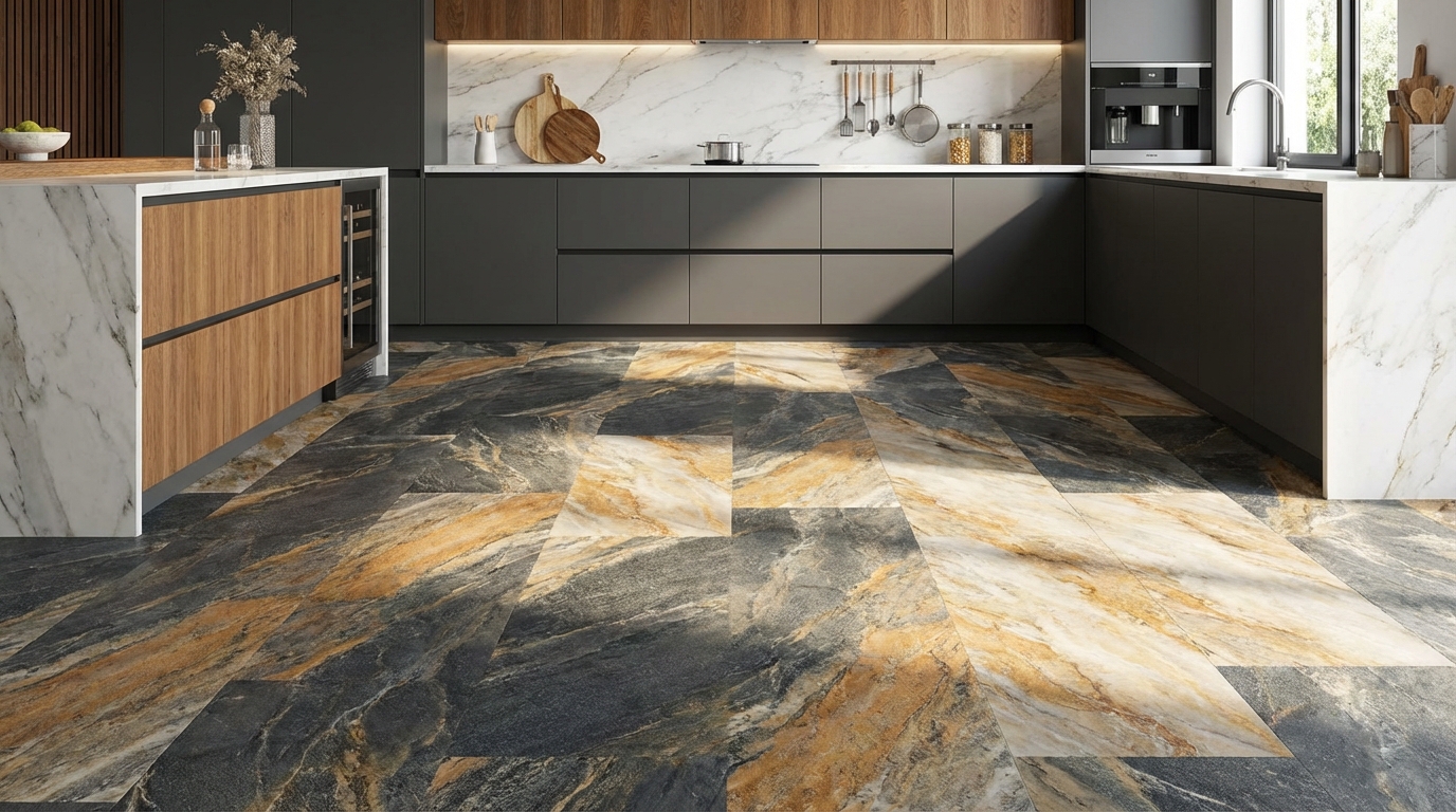
Kitchens
You get the classic tile look without standing on rock all day. Vinyl is also more forgiving when you drop dishes.
Key notes:
- Pick a pattern with some variation to hide crumbs and smudges.
- Plan layout around the island or main work area so you do not end up with skinny cuts.
Bathrooms
Stone-look vinyl is popular because it mimics tile but avoids cold surfaces and grout maintenance issues.
Check:
- Warranty for high-moisture installation.
- Slip resistance of the finish, especially if you have kids or older adults.
Basements
Basements often have moisture or temperature swings. Real stone can work, but vinyl is lighter and easier to install over concrete.
A stone look here gives that finished, grounded feel without a complicated subfloor approach.
Entryways and mudrooms
These spaces take a lot of abuse and dirt. Stone-look vinyl is easier to clean than grout-heavy ceramic and often handles impact better.
Look for higher wear layers and scratch-resistance ratings.
Key technical details to check on the label
You do not need to become a flooring engineer, but a few specs matter if you want realism and performance.
Wear layer thickness
The wear layer is the clear protective layer on top of the print.
- Look for at least 12 mil for normal homes.
- 20 mil or higher if you have large dogs, heavy traffic, or you are doing a large open area.
Thicker wear layers usually come with better finishes that keep the stone look crisp longer.
Overall thickness
Overall plank or tile thickness affects feel and sound.
- Rigid core tiles around 5 to 8 mm tend to feel more “solid” than very thin glue-down pieces.
- If you are installing next to existing flooring, thickness matters for transitions.
Embossing type
If the line offers embossed-in-register (EIR), that often signals more realistic texture.
Ask the retailer or check the manufacturer specs. They often highlight EIR as a premium feature.
Warranty and intended use
Look for:
- Residential or commercial rating.
- Areas allowed: kitchens, baths, basements, three-season rooms, etc.
A product rated for light commercial usually has stronger finishes, which helps preserve the stone illusion over time.
Installation details that affect realism
You can buy the best stone-look vinyl and still end up with a fake feel if the install is rushed or careless. This is one place where tech meets craftsmanship in a very practical way.
1. Layout planning
Before a single tile is glued or clicked, the installer should plan the layout:
- Centering patterns in main sight lines.
- Avoiding skinny cuts at walls and doorways.
- Mixing tiles from multiple boxes to spread pattern variation.
A natural stone floor rarely has a row of skinny slivers at one wall. Getting this right helps the brain accept the floor as more “real.”
2. Stagger and randomness
Patterns in nature are irregular. Installers can mimic that by:
- Rotating tiles randomly (unless the pattern has directional veining that must flow).
- Avoiding simple brick patterns for certain stone looks when it feels too rigid.
Ask your installer to dry-lay a few rows and get your approval before gluing or locking everything down.
3. Seams and tight joints
Wide gaps or misaligned faux grout lines are fast giveaways.
- For click tiles, joints must be fully engaged; no peaks or lipping.
- For glue-down, proper rolling with a floor roller is key to avoid bubbles and lift.
If you are installing yourself, do not skip the roller on glue-down jobs. It is not a marketing thing, it is about getting full contact and accurate seams.
4. Transitions to other floors
A convincing stone look also depends on how it meets other floors.
- Use low-profile transitions when possible.
- Match heights carefully so you do not feel a big step between spaces.
A smooth, clean transition feels more like a continuous design choice than two different floors fighting each other.
Common myths about stone-look luxury vinyl
“People can always tell it is vinyl”
That used to be closer to true. Early prints, repeated patterns, and glossy finishes made it obvious.
Newer products with:
- Matte coatings
- High-resolution graphics
- Embossed-in-register texture
- Thoughtful installation
often have guests guessing. They might say “nice tile” without realizing it is vinyl.
In practice, most people stop thinking about the material if the floor matches the room’s style and feels good underfoot.
“Vinyl is always cheap-looking”
Price and look do not always line up, but there is a correlation. Very low price per square foot often means:
- Fewer pattern faces
- Lower-end textures
- Shinier finishes
Mid to upper tier products cost more but often cross the line into “Is that stone?” territory. If realism is your priority, budget more than the bargain-bin level.
“Stone-look vinyl will fade or peel quickly”
Good products have UV-resistant finishes and stable construction. You still want to:
- Close blinds during intense direct sunlight hours.
- Use felt pads under furniture.
But peeling top layers are mostly a sign of poor-quality material or installation over a bad subfloor.
How technology is improving stone-look vinyl
Since you are on a technology blog, it is worth looking briefly at what changed behind the scenes.
Better digital printing
Manufacturers use higher-resolution scanners and printers to capture and reproduce real stone slabs. Color management systems keep hues consistent across batches.
Impact for you: More lifelike depth, smoother gradients, and fewer “banding” artifacts in color.
Laser-guided embossing
To sync texture to image, some production lines use laser or computer-guided embossing plates.
Impact for you: When your eye sees a cleft, your finger feels a cleft. That alignment sells the illusion.
Advanced coatings and wear layers
Topcoats now include ceramic or aluminum oxide elements and micro-textured finishes.
Impact for you:
- Better scratch resistance.
- Less obvious sheen.
- Longer life before the “stone” image looks tired.
3D visualizers and AR apps
Many flooring brands now offer room visualizer tools or augmented reality apps. You upload a photo of your room or use your phone’s camera, and it maps the floor with the product.
Impact for you:
- You can see how pattern scale and color work with your walls and cabinets before you buy.
- Helps you spot patterns that feel too busy or too plain.
Even if the tool is not perfect, using a visualizer for 10 minutes can save days of second-guessing later.
Questions to ask before you buy
Here is a quick question list you can screenshot or jot down for your store visit:
- How many unique print faces does this stone-look line have
- Is the surface embossed in register, or is it a generic texture
- What is the wear layer thickness in mils
- Is the finish matte, satin, or gloss
- Can this tile be installed with real grout, or are the grout lines faux
- Is it glue-down, click rigid core, or loose lay
- What is the warranty for kitchens, bathrooms, and basements
- Can I take at least 4 to 6 loose samples home
If the salesperson cannot answer these, ask them to pull the manufacturer spec sheet. Those details are usually there.
Practical tip to finish: do the “walkaway test”
Once you have a few favorites, lay them out in the room where you want the floor. Then do this simple test:
- Place the samples on the floor in a small cluster, like they would appear installed.
- Walk to the other side of the room.
- Turn around and walk back in as if you are entering a friend’s house.
Pay attention to your first impression, not the details.
If your brain says “nice floor” and does not immediately jump to “that looks like vinyl,” you are close. If the samples keep nagging at you, keep looking.