So, you are trying to figure out how to pull off maximalism with pattern clashing using rugs and tiles without your space looking chaotic or random. The direct answer is: pick a clear color story, control scale, repeat key shapes, and then layer patterns in a planned way so it feels bold but still intentional.
You are not alone if your brain goes, “I love all these patterns” and then freezes when it is time to combine them. Maximalism looks wild at first glance, but the rooms that work usually follow a few quiet rules. Think of it like curating a playlist. You can mix rock, jazz, and hip hop, but you need the right beats and transitions so the whole thing flows.
Things you need to know:
- Pick 2 to 4 main colors and keep coming back to them across rugs, tiles, textiles, and decor.
- Mix pattern scales: one large, one medium, one small, instead of 3 loud patterns fighting for attention.
- Repeat shapes or motifs (stripes, florals, geometrics) so your eye finds a rhythm.
- Use rugs and tiles as “anchors” that set the tone for the rest of the room.
- Neutrals still matter; they give your patterns room to breathe.
- Start from the floor up: decide tiles and rugs first, then add furniture and accessories.
- Test patterns together on a flat surface before you buy or install.
- Pattern clashing is not random; it is controlled contrast.
Why maximalism and pattern clashing even work
When you look at a good maximalist room, you see a lot at once: different colors, different shapes, maybe vintage next to new, glossy next to matte. Rugs and tiles are usually the strongest pieces in that mix. They stay put, they set the mood, and they frame how you move through the space.
A tile floor or tiled wall is like the intro track of your playlist. It gives rhythm and structure. Rugs add warmth, softness, and depth over that base. When you clash patterns intentionally between those two, you get tension. Not stress. Good tension. The kind that makes your brain go, “Wow, that should not work, but it does.”
The trick is that your brain wants some order. Color harmony, scale balance, and repetition give you that order, even if the patterns themselves are loud.
> Maximalism is not about adding everything you like. It is about choosing what you love, then building rules around it so your space still feels liveable.
Step 1: Decide your color story before you touch a tile sample
If you start with “I like this tile” and “I like that rug,” there is a high chance you will end up with things that do not talk to each other. Color is your shared language.
Pick a simple color structure
For most rooms, this works well:
- 1 main base color (often a neutral like white, cream, gray, warm taupe)
- 1 primary accent color (deep green, navy, rust, terracotta, mustard)
- 1 secondary accent (pink, teal, burgundy, black, etc.)
- Optional: 1 metallic (brass, chrome, black metal) to repeat in hardware
You do not need all of them in equal amounts. The base color often sits in the background: walls, grout, maybe the quieter areas of the tile. The accent colors show up in the bold patterns on your rug and tiles.
For example:
- Base: warm white
- Primary accent: deep forest green
- Secondary accent: burnt orange
- Metal: brushed brass
Now your job is not “find a cool rug” but “find a rug that repeats forest green and burnt orange, even if the pattern is very different from the tiles.”
How to check if colors work together
Very simple method:
- Put samples or screenshots of the rug, the tile, and your wall color on one screen or table.
- Squint your eyes or step back 3-4 meters.
- If one color jumps out as random, it probably is.
You want at least one color that shows up in both the rug and the tile. They do not need to match exactly, but they should be in the same family: olive and forest, rust and terracotta, etc.
> If you only remember one rule: connect your rug and tile through color or shape, not both. Color is simplest.
Step 2: Use scale smartly so your patterns do not shout over each other
Pattern scale is how big the shapes are. A giant floral is large scale. Tiny herringbone is small scale. Bold checkerboard is medium to large, depending on tile size.
When you clash patterns, balance is less about style and more about size.
The basic scale recipe
Pick:
- 1 large scale pattern
- 1 medium scale pattern
- 1 small scale pattern or texture
That is usually enough for most rooms. You can repeat these in pillows or art, but stay close to this mix.
Examples with tiles and rugs:
| Element | Good pairing | Risky pairing |
|---|---|---|
| Tiles | Huge graphic cement tile pattern (large) | Busy small mosaics plus tiny geometric wall tile |
| Rug | Small, tight Persian pattern (small) | Another huge, bold geometric (large) |
| Walls | Solid paint or soft limewash (texture only) | Bold wallpaper with large pattern |
So if your floor tile is loud and large in scale, let your rug carry a finer, tighter pattern. If your tiles are tiny mosaics, maybe your rug gets to be chunkier in design.
> When everything is large scale, the room feels like it is vibrating. When everything is tiny, it turns into visual noise.
Step 3: Choose your pattern “families”
Patterns usually fall into a few broad groups:
- Geometrics (stripes, checks, grids, triangles, hexagons)
- Florals and botanicals (leaves, vines, flowers)
- Traditional repeats (Persian, kilim, Moroccan, Greek key)
- Abstracts (brush strokes, splatters, irregular prints)
For a maximalist room, you often want at least two families playing together. But if you have four wildly different styles, the room can feel disjointed.
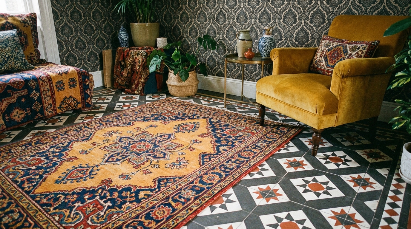
Winning pattern combos with rugs and tiles
Here are a few pairings that usually work well.
| Tile pattern | Rug pattern | Why it works |
|---|---|---|
| Black and white checkerboard | Colorful Persian or kilim | Geometric tile gives structure, Persian rug adds rich detail and color |
| Hexagon tiles in two tones | Striped or banded rug | Both geometric, but one is honeycomb, one is linear |
| Simple subway tile in a bold layout (herringbone, stack bond) | Wild abstract rug | Tile pattern is subtle; rug brings the “clash” |
| Large-scale Moroccan cement tile | Quiet, textured rug (jute, sisal, subtle weave) | Floor is the star; rug adds warmth without competing |
| Terrazzo tile with multicolor chips | Bold stripe or large plaid | Terrazzo is scattered; stripes give direction |
The pattern clash you want is contrast in style, not chaos in direction. For example, organic floral rug over strict geometric tile looks intentional because you are mixing opposites.
> A helpful test: describe the combo in one sentence. If you cannot explain it, it might feel random when installed.
Step 4: Let rugs and tiles anchor different zones
Maximalism often shines in open areas where you have more than one function in the same space: kitchen plus dining, living plus workspace, etc. Tiles and rugs can define “zones” without building walls.
Using tiles as permanent anchors
Tiles are hard to change, so treat them as the long-term anchor.
Good spots for strong tile patterns:
- Entryways and foyers
- Kitchen floors or backsplashes
- Bathroom floors and shower walls
- Fireplace surrounds
In an entry, for example, a bold patterned cement tile can announce: this house leans maximalist. Then your rug in the nearby living area can respond to it with echoing colors and a different pattern family.
Rugs as flexible “pattern bridges”
A rug can connect two tile moments or soften a very busy floor.
Example setup:
- Kitchen: checkered terracotta and cream tile
- Adjoining dining: wood floor with a floral rug
The floral rug can pick up the terracotta tone from the kitchen tile, even if the pattern is very different. So from one view, you see the tile pattern, then your eye lands on the rug that shares the color but not the shape.
> Think of your rug as a translator between your tile and your furniture. It speaks both languages: hard surface and soft pieces.
Step 5: Layering patterns in different rooms
Let us walk through room types, since tile and rugs play different roles in each.
Living room: rugs lead, tiles support
In most living rooms, tile is either on the floor or around a fireplace. The rug is usually the bigger visual opportunity.
A simple formula:
- If your floor tile is plain (concrete, large porcelain, simple stone), your rug can carry strong pattern and color.
- If your floor tile is heavily patterned, choose a rug with tighter, more tonal pattern or a neutral weave.
Here is an example scenario:
- Floor: large, cool gray porcelain tile in a grid.
- Fireplace: bold green pattern tile.
- Rug: rich vintage-style rug with reds, greens, and blues.
The rug clashes in style with the geometric fireplace tile (traditional vs geometric), but shares green tones. The big plain floor underneath keeps it from feeling overloaded.
Kitchen: tiles in charge, rugs as accents
In a kitchen, tile often dominates because:
- Bigger surfaces: floor and backsplash.
- Hard, reflective materials.
So be picky. If you want strong floor tile and a statement backsplash, let the rug or runner stay more neutral in pattern, but still hold color.
Example:
- Floor: black and white checkerboard.
- Backsplash: white subway, stacked vertically.
- Rug: slim runner, Persian style, deep red and navy, small-scale print.
Here the “clash” is: very graphic floor vs very detailed runner. The subway tiles are calm, so you are still within a controlled range.
Quote this in your head when planning:
> 2 strong moves in a kitchen is usually enough: one floor, one textile, or one backsplash, one rug. The third big move can be color on cabinets, not more pattern.
Bathroom: pattern boxing ring in a small space
Bathrooms can handle bold moves because:
- They are smaller.
- You do not spend all day there.
Common pattern spreads:
- Floor tile + shower tile + bath mat or runner.
You can clash pretty hard here. For example:
- Floor: tiny black and white penny tiles.
- Shower: large white tiles in a vertical stack layout.
- Rug: striped bath rug in green and cream.
Here the penny tiles buzz with energy, the large shower tiles calm things down, and the rug adds a third rhythm with stripes. All still hang together through neutral white and a repeating dark tone.
Entry and hallway: small footprint, big impact
These areas often give you tile + runner. That is a classic pattern clash stage.
Try this structure:
- Floor tile: graphic geometric in 2 colors.
- Runner: organic pattern (floral, Persian, abstract).
You step into the tile, then the runner pulls you forward. They clash in style but share one or two colors.
Step 6: Neutrals as breathing room, not an afterthought
Maximalism still needs quiet space. Neutrals do not kill the look. They frame it.
You can bring calm with:
- Wall color: off-white, greige, very light clay, or pastels.
- Sofas and big furniture: solid fabrics.
- Ceilings: usually light and simple.
If your rug and tiles are doing heavy pattern work, try to keep at least one major surface neutral. Think of it like leaving margins on a page. The text looks better when it is not printed edge to edge.
> The bolder your rug and tile combo, the more you should respect negative space on walls and large furniture.
Step 7: Grout, texture, and finish matter more than people expect
Grout color and tile finish quietly shape how strong the pattern feels.
Grout rules for maximalist spaces
- High contrast grout (white tile with black grout) makes the pattern loud.
- Low contrast grout (white tile with light gray grout) softens the grid.
- Matching grout on patterned cement or printed tiles stops lines from cutting through the design.
If you already have a wild rug planned, consider softer grout so the tile pattern does not compete even more.
Texture and finish
Glossy tile reflects light and catches your eye faster than matte tile. Large glossy patterns plus a busy rug can feel like “too much” because your eye keeps jumping.
You can balance like this:
- Glossy patterned backsplash + matte floor tile + patterned rug.
- Matte patterned floor tile + low pile wool rug + simple painted walls.
Texture in rugs also affects how your tile reads. A woven jute rug on top of slick porcelain instantly adds depth. A thick, high-pile rug on patterned tile might hide too much of the tile and make pattern decisions feel wasted.
Step 8: Sample, test, and photograph before committing
Maximalist pattern clashing is one of those things that can feel perfect in your head and messy in real life. Sampling is boring, but it saves money and stress.
How to test combos at home
- Order small tile samples and swatches of rugs or similar fabrics.
- Lay them out on the floor with your wall paint chip.
- Take photos in morning, midday, and evening light.
Then ask yourself:
- Do I like looking at this photo for more than 10 seconds?
- Does one pattern totally overpower the other?
- Can I point to one color that connects them?
Your gut reaction is the real one. If something bugs you in a sample, it will bother you more once you have spent time and money installing it.
> If you cannot get samples for an online rug, print screenshots at the same scale and lay them next to your tile samples. It is not perfect, but it is better than guessing.
Step 9: Common mistakes and how to fix them
Even with planning, maximalism can go sideways fast. Here are issues I see a lot.
Mistake 1: No clear color links
Problem: You loved a blue and white tile and a red and orange rug, but they have nothing in common. The room feels like two different stories.
Fixes:
- Add a third textile (pillow, curtain, throw) that has both blue and red.
- Bring a neutral element that appears in both pieces, like a natural wood tone.
- Change one item to a version that shares at least one color family.
Mistake 2: Too many showpieces in one view
Problem: Patterned tile floor, patterned wall tile, bold rug, strong wallpaper, all visible at once.
Fixes:
- Pick 1 or 2 “heroes” for each sightline.
- If you love multiple bold elements, position them so you see them from different angles, not all layered.
- Use solid or subtly textured curtains and large furniture to calm things down.
Mistake 3: Patterns that almost match
Problem: Two geometrics that are very similar but not quite. Your brain wants them to line up, and they do not, which feels off.
Fixes:
- Go for clear contrast instead. Pair triangles with floral, or circles with stripes.
- If you stay in one family, change the scale aggressively: very large checks with tiny diamonds.
> Near-matches are often worse than big differences. Your eye reads them as mistakes.
Step 10: Making maximalism liveable
A maximalist rug and tile combo still has to work every day. Shoes, pets, spilled coffee, sunlight, all of that.
Practical choices that still look bold
Things to think about:
- Rug material: wool ages well, hides dirt, and can handle pattern without looking tired.
- Tile material: porcelain is easier for floors than some cement tiles, especially in heavy traffic areas.
- Color depth: mid tones hide wear better than very light or very dark surfaces.
Maximalism does not mean ignoring function. If your kitchen floor gets heavy use, a patterned tile in slightly speckled or mottled finish will hide crumbs and smudges better than flat solid color.
Pattern aging and trend resistance
Trends move fast. Checkerboard, for example, is everywhere right now, and it actually holds up pretty well over time because it is a classic. Some patterns date more quickly.
You can reduce regret by:
- Putting the most “trendy” moves in rugs, not tiles, since rugs are simple to swap.
- Choosing classic geometries or historical motifs for permanent tile (checkerboard, herringbone, hexagon, Moroccan star, etc.).
Then let your rug do the wild, current thing. If your taste changes, you roll it up and change it out.
Real-world pattern clash examples to steal
Let me give you three quick layout recipes you can adapt.
Recipe 1: Warm maximalist kitchen
- Floor: terracotta-look hexagon tile, some hexes in deeper brown for a quiet pattern.
- Backsplash: simple glossy cream tile in a vertical stack layout.
- Rug: long runner with traditional pattern in rust, navy, and cream.
- Cabinets: olive green.
Why it works:
- Color link: terracotta floor pairs with rust in the runner.
- Pattern contrast: organic Persian rug vs strict hex grid.
- Neutrals: cream backsplash gives your eye a break.
Recipe 2: Bold living room with tiled hearth
- Floor: large format neutral porcelain in warm gray.
- Fireplace tile: blue and white Moroccan-inspired pattern.
- Rug: oversized plaid or stripe in mustard, navy, and ivory.
- Sofa: solid camel or charcoal fabric.
Why it works:
- Geometric vs geometric, but very different direction: curved, intricate hearth tile vs straight stripes or plaid.
- Shared blue ties fireplace to rug.
- Plain sofa stops things from feeling like a showroom of patterns.
Recipe 3: Maximalist bathroom with quiet rug
- Floor: black and white tiny hex tiles with subtle floral layout.
- Shower wall: solid teal tile in a brick pattern.
- Rug: low pile cotton mat in off-white with a small black border.
Why it works:
- Floor is the main star pattern.
- Shower tile brings color but not more small pattern.
- Rug is almost plain, so you see the floor tile clearly.
> When you copy a recipe, keep the logic more than the exact colors. Structure matters more than matching photos from social media.
How to build your own pattern clash mood board
If you like a more methodical step-by-step, here is a practical flow.
Step A: Choose your “must-have” piece
Decide what you refuse to compromise on. Maybe it is a specific rug you love or a tile you have dreamed about. That becomes your anchor.
Step B: Pull colors from that anchor
Take a photo, drop it into any color picker tool, and grab 3 to 5 key shades. Or do it manually with paint swatches.
Step C: Set the roles
Define:
- Which pattern will be strongest? (floor tile or rug?)
- Where you can allow quiet surfaces? (walls, ceiling, big furniture.)
Write it down, so you do not keep upgrading every single thing to “showpiece” level.
Step D: Hunt for the counterpoint pattern
If your anchor is:
- A floral rug: look for geometric tiles that repeat at least one color.
- A graphic tile: look for softer, more organic rugs or tighter traditionals.
Keep repeating this question: “What is this complementing or balancing?”
Step E: Add one small-scale pattern or texture
This can be:
- Fine woven curtains
- A subtle herringbone wood side table
- Small check or stripe in cushions
That small pattern helps stitch your big moves together.
Using lighting to help your patterns, not fight them
Lighting can either flatten patterns or help them read clearly.
What to watch for
- Spotlights directly over glossy tile can cause glare that hides pattern details.
- Warm bulbs bring out terracotta, pinks, and warm neuters.
- Cool bulbs can make whites look blue and some colors feel harsher.
If your rug is full of subtle color shifts, a very cool overhead light can kill that nuance. Aim for a warm or balanced white (often labeled around 2700K-3000K) in living spaces, so your patterns feel rich, not cold.
> Before finalizing, take your samples under the lights you plan to use. You might switch a bulb and suddenly like your pattern clash a lot more.
Borrowing from other design fields: fashion and graphics
If you are stuck, think about how fashion uses pattern clashing.
A common fashion formula:
- Stripes + florals
- Checks + animal print
- Polka dots + abstract
They keep one color story consistent, then vary the pattern family. Home design works the same way.
Graphic design, too, mixes typefaces. Usually, you see:
- One bold display font
- One clean, simple font for body text
Tiles and rugs are your fonts. One can scream, the other must read clearly. If both scream, you need more white space.
A quick checklist before you buy
Use this short list when you think you have your rug-tile combo locked in:
- Can I point to at least one color that appears in both pieces?
- Do I have one large scale pattern, one medium, one small or textured?
- Is there at least one surface or big item that is mostly solid or neutral?
- Do my patterns feel intentionally different, instead of almost matching?
- Do I feel good when I look at it from across the room in a photo?
If you answer “no” to two or more, keep tweaking.
One final practical tip: build the room on paper (or screen) before you build it in real life. Open a simple design app or even a slide deck, drop in photos of tiles, rugs, walls, and furniture, then look at it in thumbnail view. If it reads strong but not chaotic at that tiny size, you are much closer to a maximalist pattern clash that actually works when you are standing in it.